Wireframing

I created low and medium-fidelity wireframes to help structure the layout. I facilitated a decision with the Product Manager and the Design Manager to present data in a single-page format. This was transformed into high-fidelity models, which were utilized as communication mediums with various stakeholders to brainstorm the details.

Rough sketches of wireframes to define structure and layout.

Making digital and colorful wireframes as artifacts for communication and sharing ideas with stakeholders.

Challenge

The primary product of CloudSEK, XVigil, is an AI-powered cybersecurity platform that investigates a variety of sources to identify and classify cyberthreats. The platform has undergone numerous developments with new features and processes, however these have not been mirrored on the primary dashboard of their product. Furthermore, the dashboard is intended to give CISOs with a comprehensive picture of their organizations' cyber threat performance.

The goal of this project was to identify how to represent data that is intuitive to use, visually aesthetic, and integrates all data points into one screen. Furthermore, the dashboard will be created for use both locally and internationally.

My responsibilities

As the principal design lead, I worked closely with the Product Manager, CEO, Design Manager, and Developers to define the design requirements. By conducting research, I was able to align user needs with business objectives, generate UX and UI designs from ideation, and oversee development by performing a design audit of the result.

Outcome

A global dashboard that incorporates the product's new functionalities and processes, connecting data via a narrative.

Timeline

September 2020 | 2 months

My role

UX/UI Designer

(sole designer)

Contributors

Design Manager, PM, CEO & Front-end Dev

Tools

Figma

Industry Partners

CloudSEK, India

designing an updated global dashboard

designing an updated global dashboard

UI Design

After finding inspiration for design and data visualization in web trends and dashboard interfaces, I built various data representations and dashboard design layouts. In addition, I completed the interface component design by defining colors and typography.

Ideation on data visualization to present exposure information

Exploring UI layouts and proceeding with a single page view.

Final Design

Dashboard Final Design

💥 Impact

Businesses' CISOs responded positively to the new dashboard designs. We received numerous suggestions to improve the design, which resulted in the addition of redirected links, better date filters, and additional options for the format of downloading reports.


As a result, we observed a significant increase in the use of the dashboard via Mixpanel analytics.

We got positive reviews for the dashboard when I got the opportunity to attend POC calls to demonstrate the new design.

Further development

The dashboard recently went through a revamp. When I joined back as a consultant, I worked on changing certain part of the dashboard. My responsibility for the improvement were defining the color scheme and visualizing data.

💡 Key Learnings

Having consistent interaction through weekly calls to update stakeholders with new data and designs allowed to keep everyone informed and have productive discussions for improvements. This communication approach was used in subsequent projects.

During discussions with stakeholders, it was challenging to convey concepts for myself and others. I observed how colorful digital interfaces served as a means of communication for non-design stakeholders to brainstorm and discuss.

As my first assignment, the dashboard design taught me how to work directly with developers by learning to communicate around coding languages such as HTML and CSS. This allowed us to communicate more effectively with the engineering teams.

Best viewed on desktop

Review my case study on the desktop. It will soon be responsive to view on mobile :)

Best viewed on desktop

Review my case study on the desktop. It will soon be responsive to view on mobile :)

Design Process

Problem definition

Concept development

Agile Iteration

Sketching and digitizing low to high fidelity wireframes.

Data visualization, color and typography definition

Conducting design quality assessment and iterating design based on feasibility constraints.

Stakeholder Intake

Discussion with CEO, PMs, sales, POC and success teams to gather requirements

Stakeholder Intake

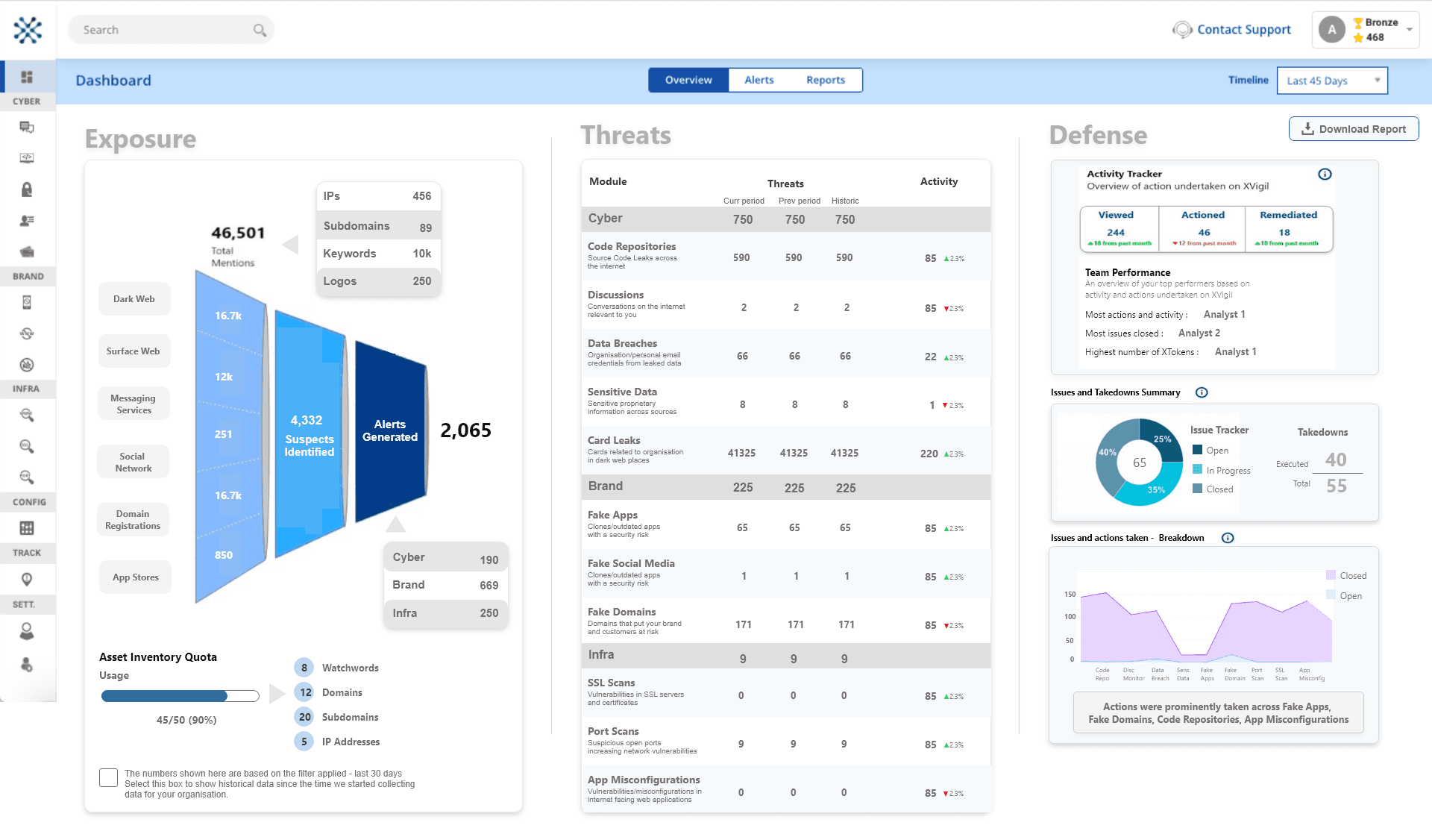
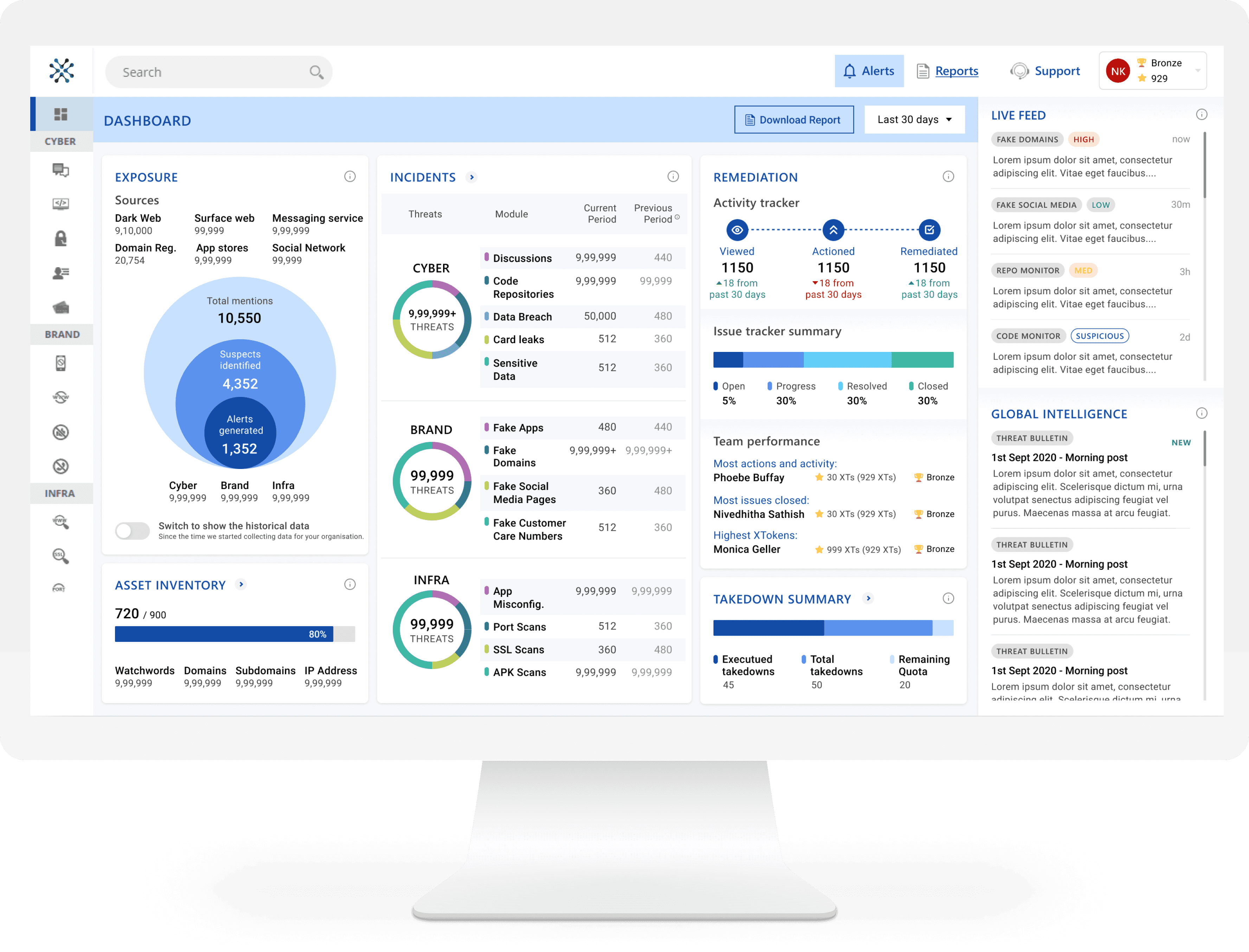
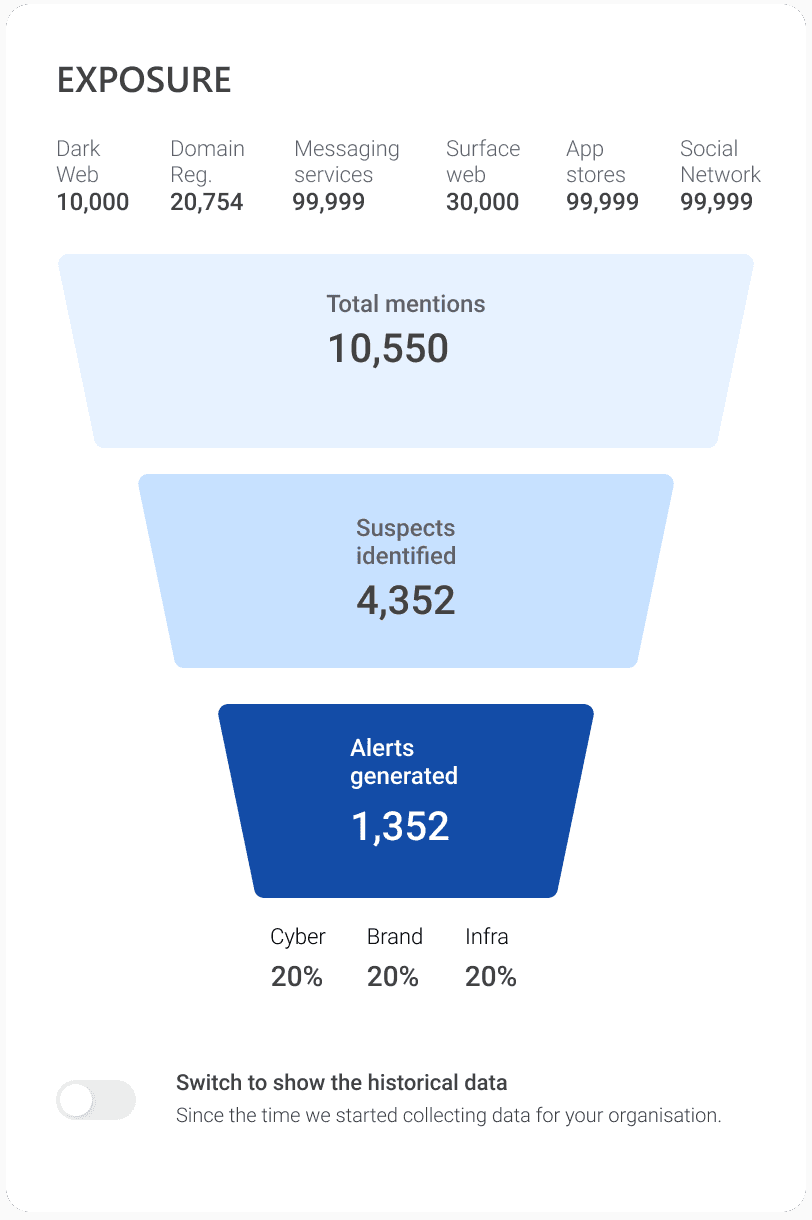
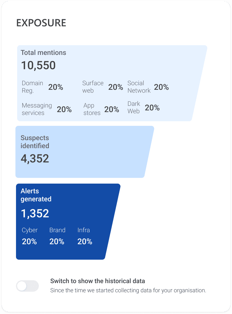
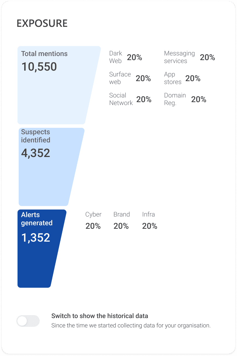
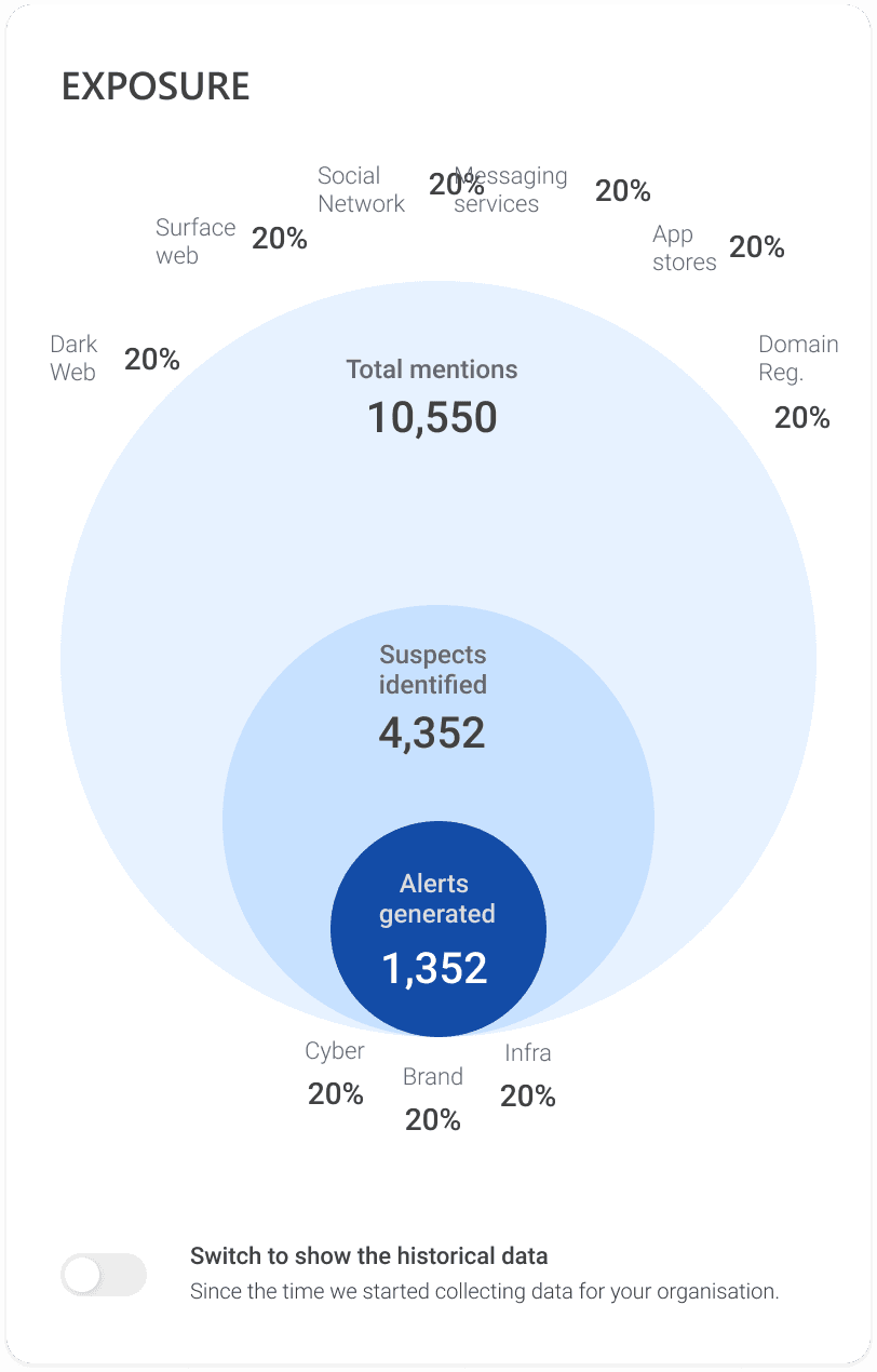
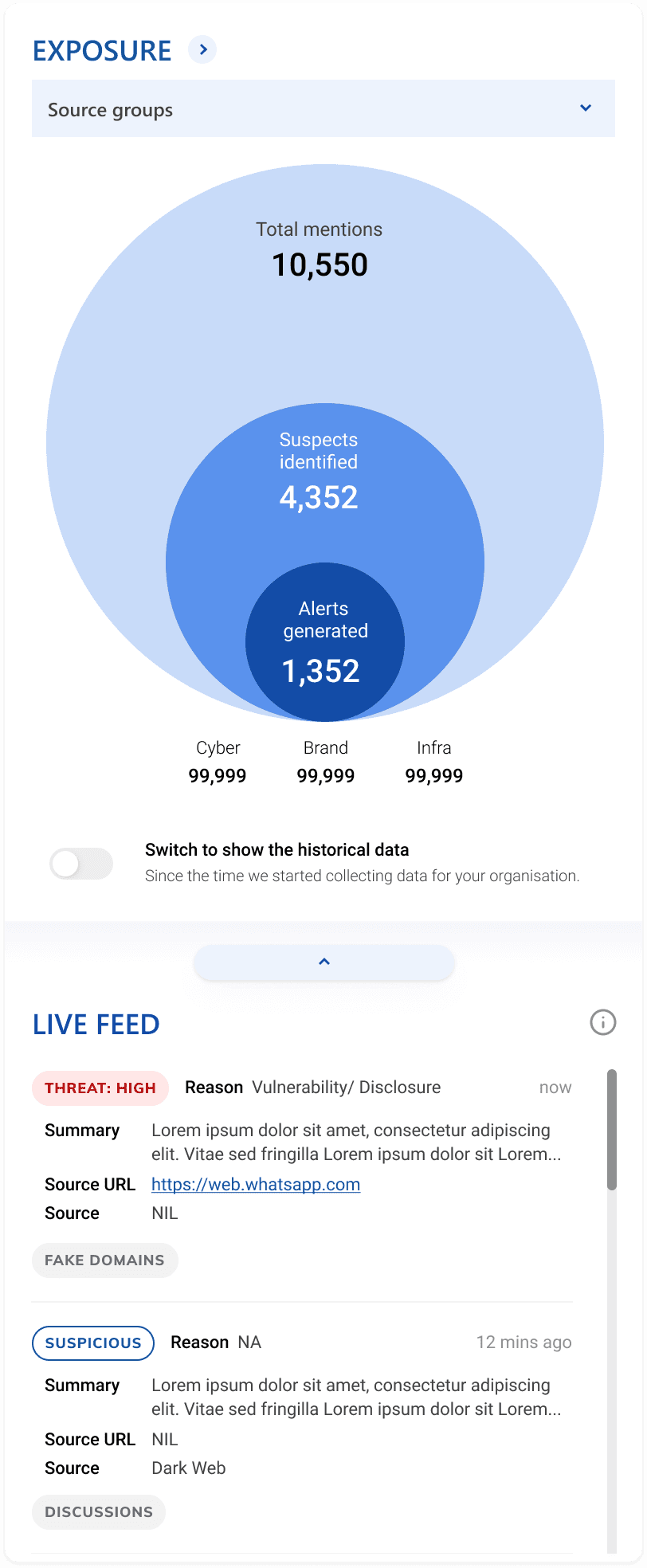
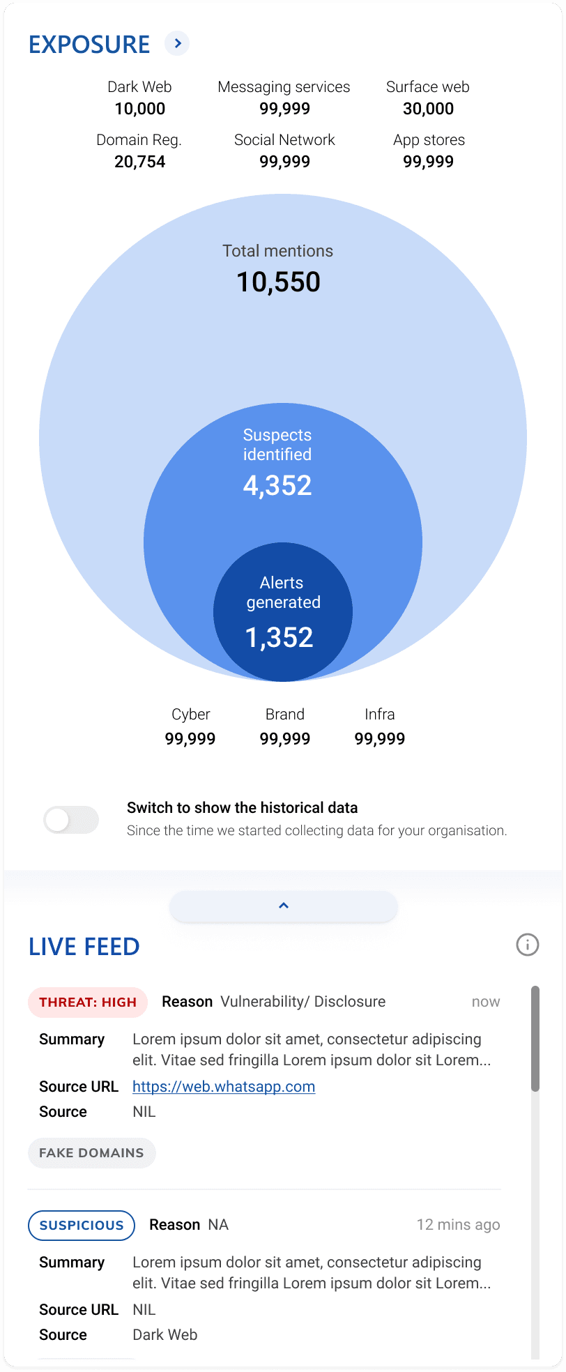
We had an introductory calls with multi-disciplinary teams like sales, POC, customer success, engineering, product managers, and CEO. Along with the Product Manager, we collected information from different teams to analyze and form the dashboard requirements. We used the previous dashboard for stakeholders to identify pain points and solution expectations.

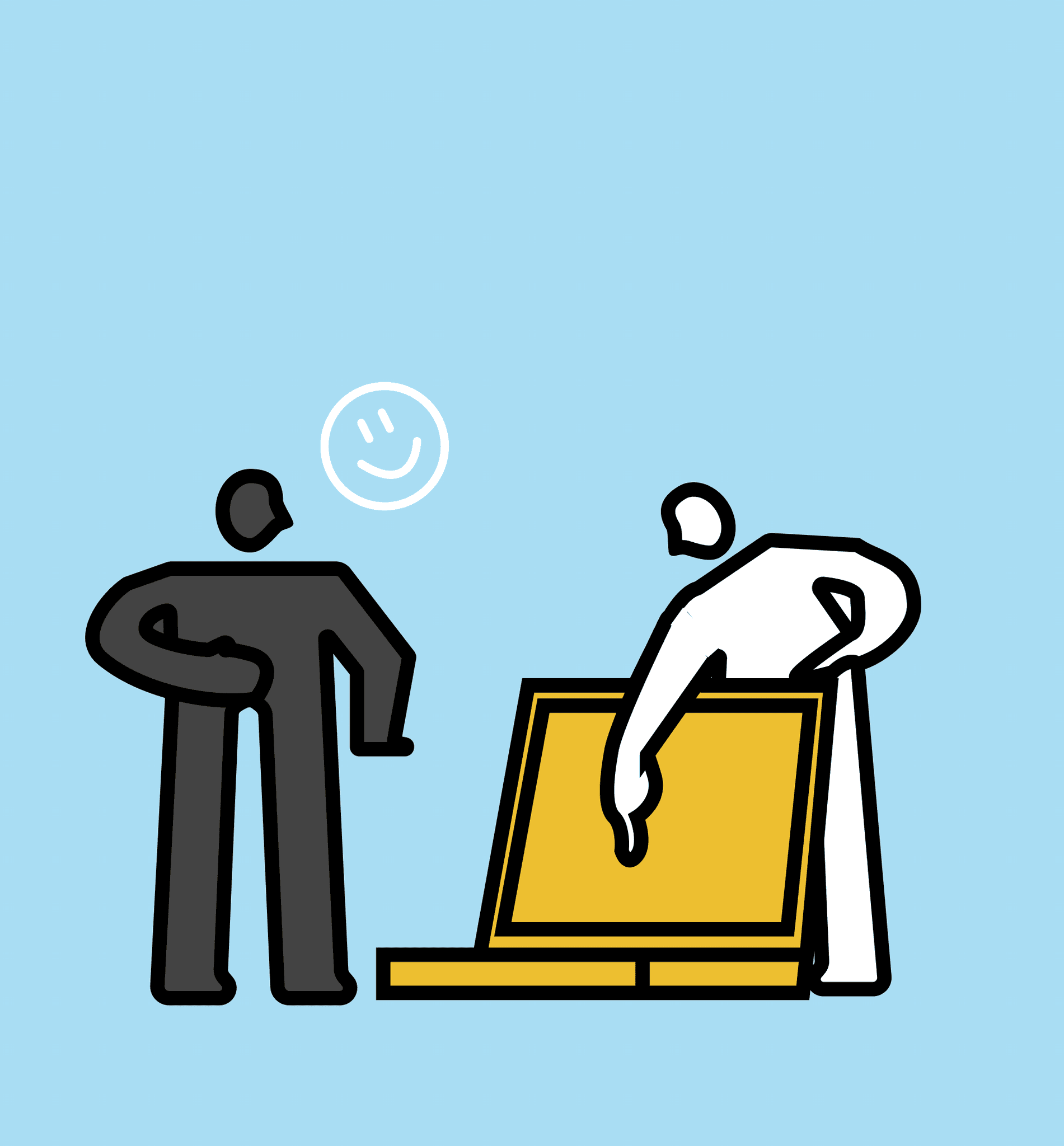
Sharing inspiration and ideas during the intake call.

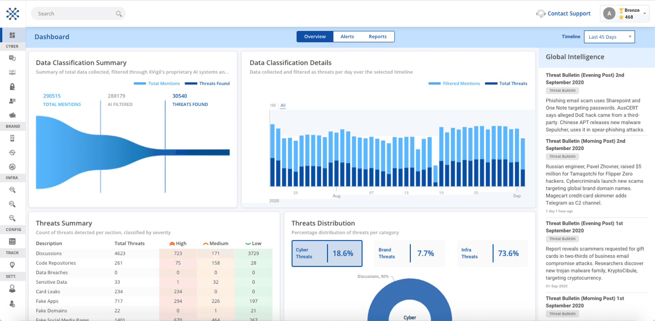
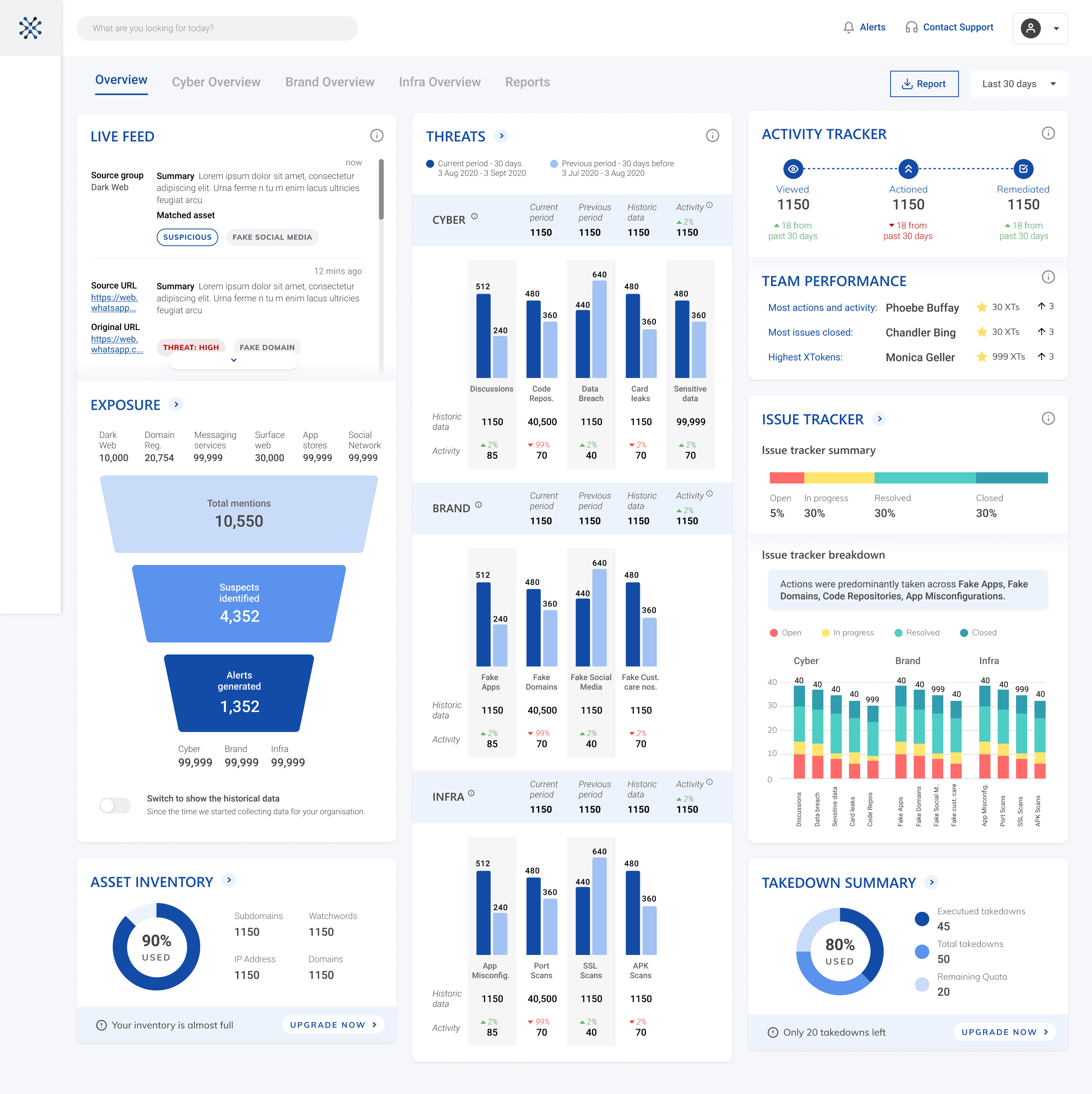
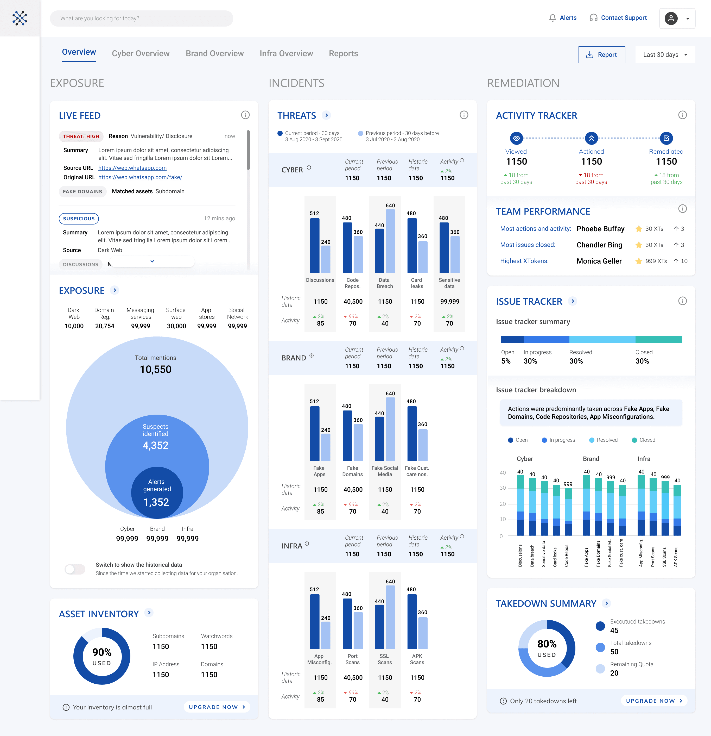
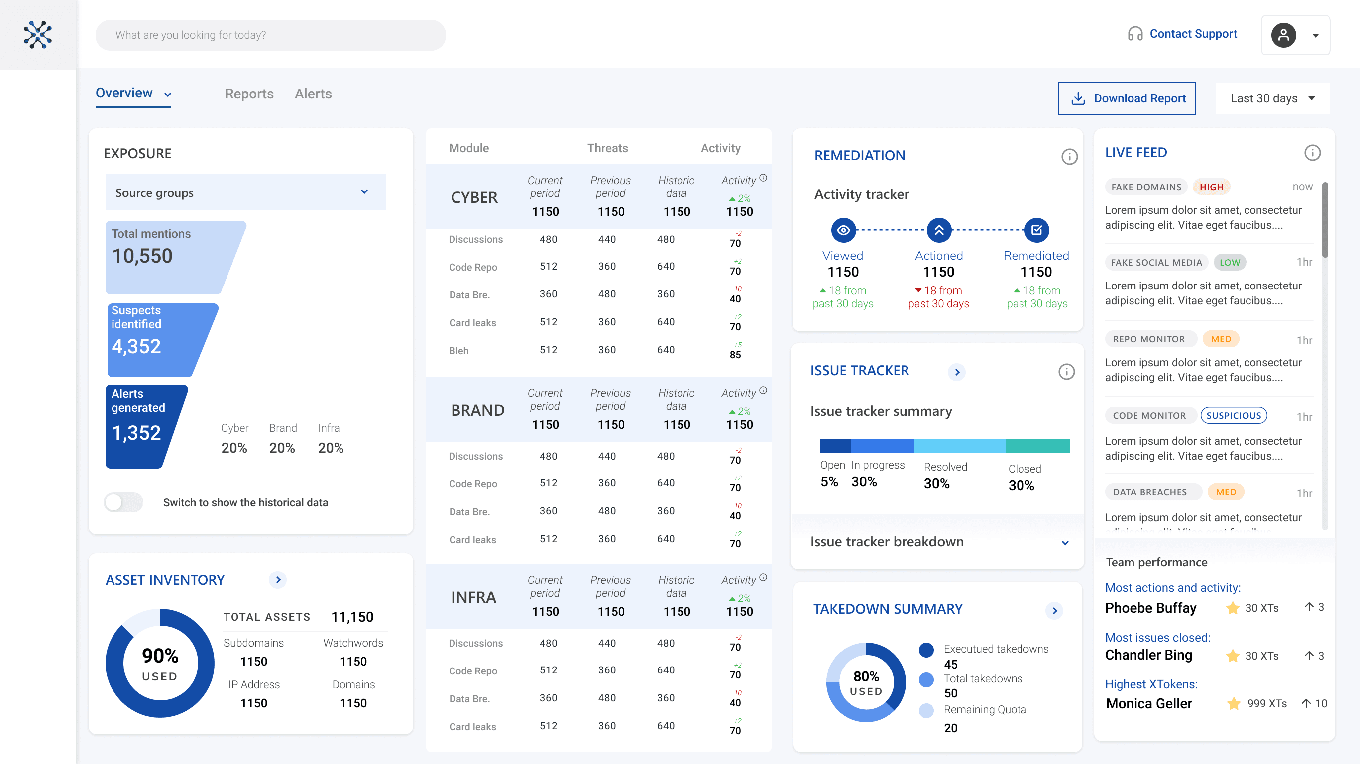
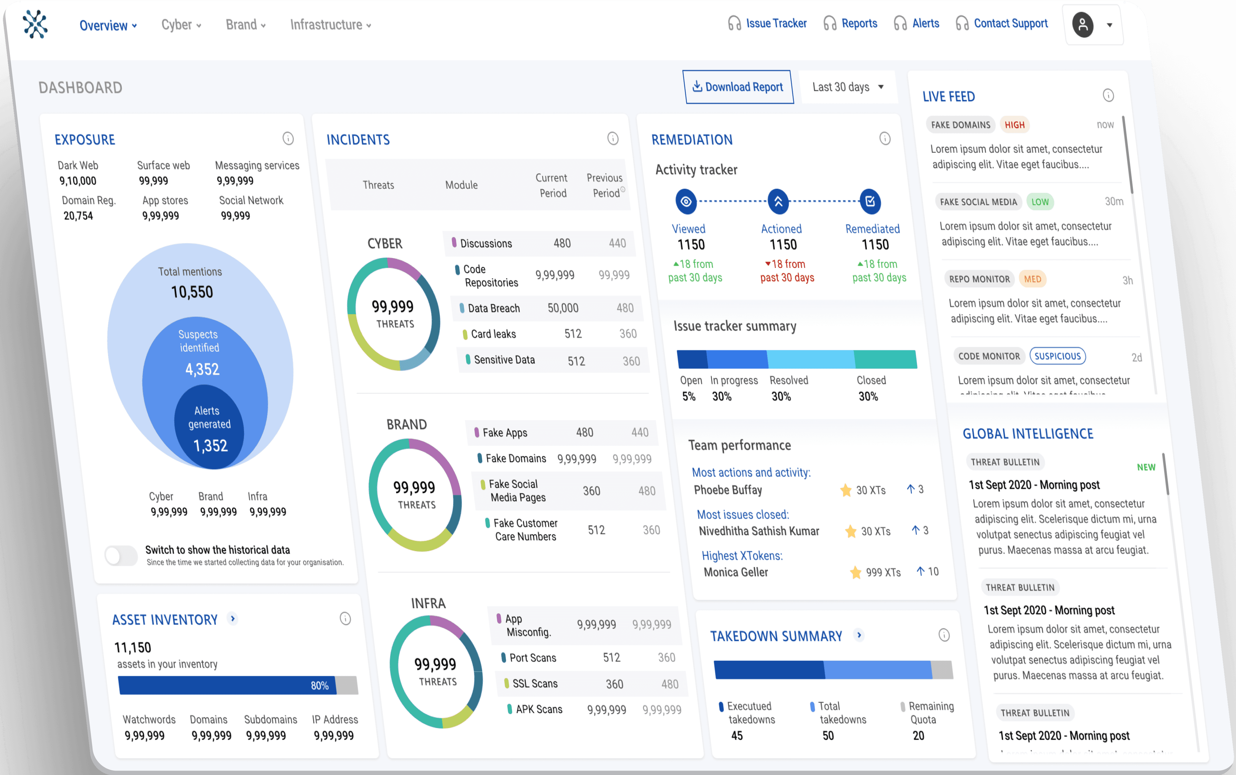
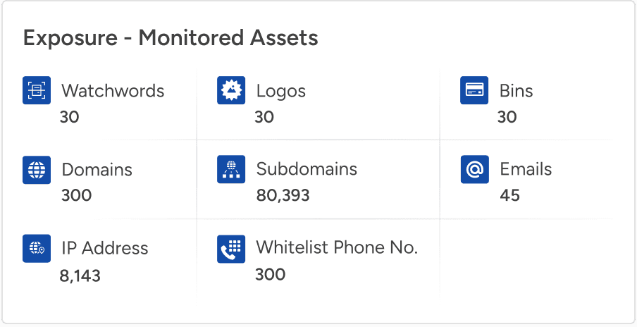
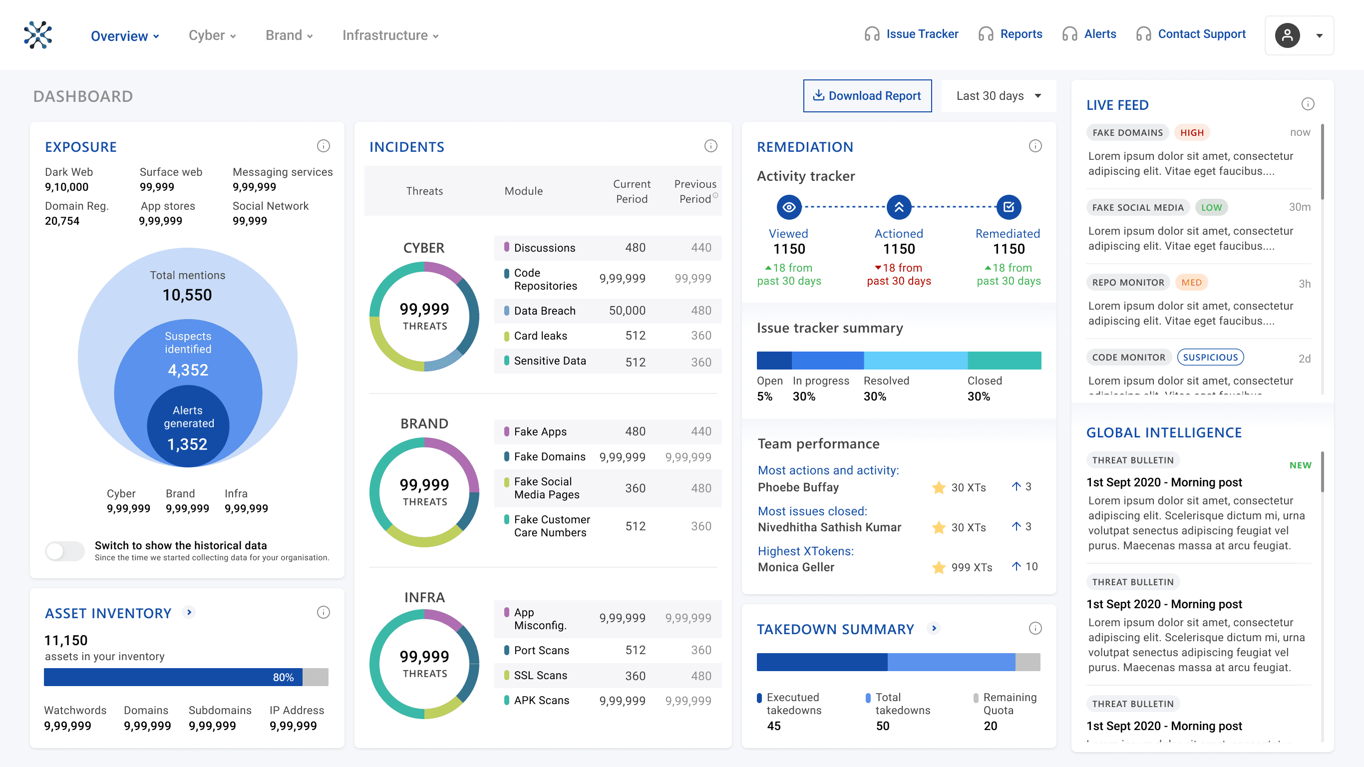
Using the previous dashboard for stakeholders to identify pain points.

💪🏽 Challenge

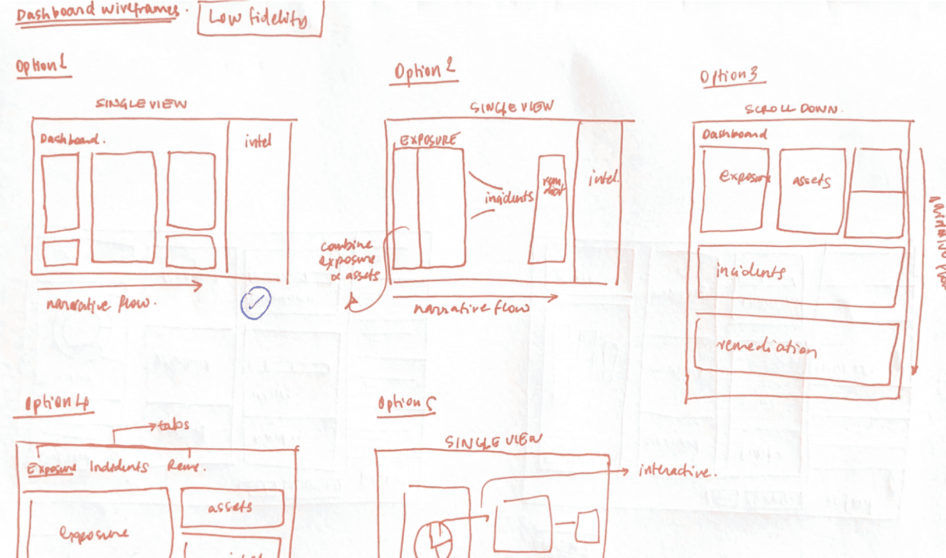
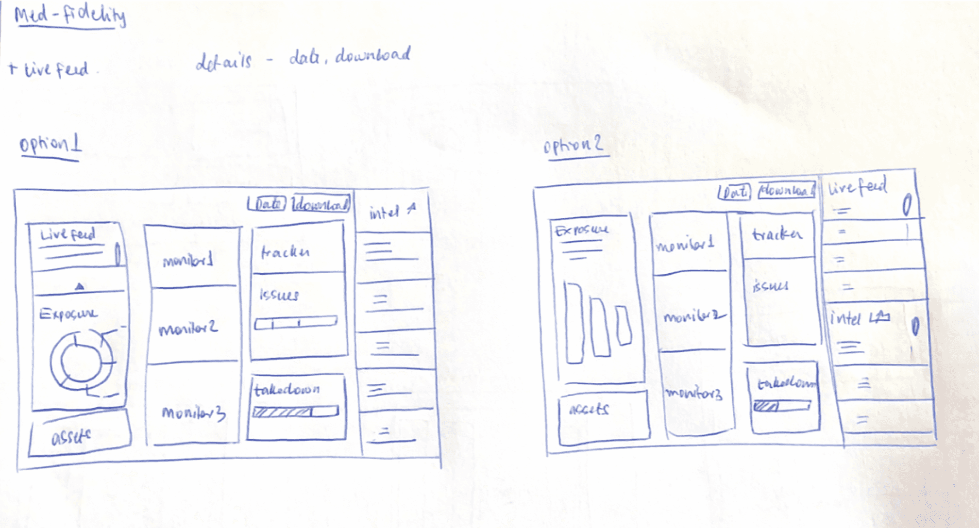
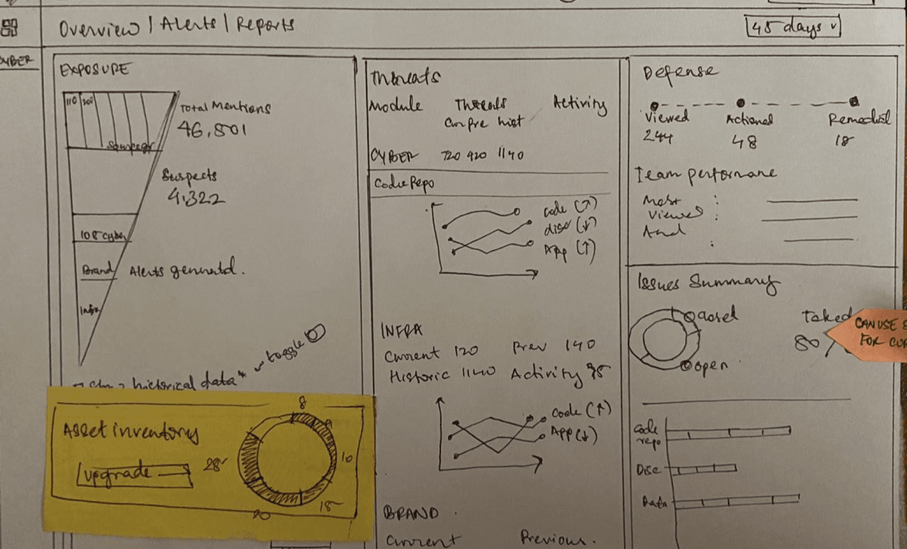
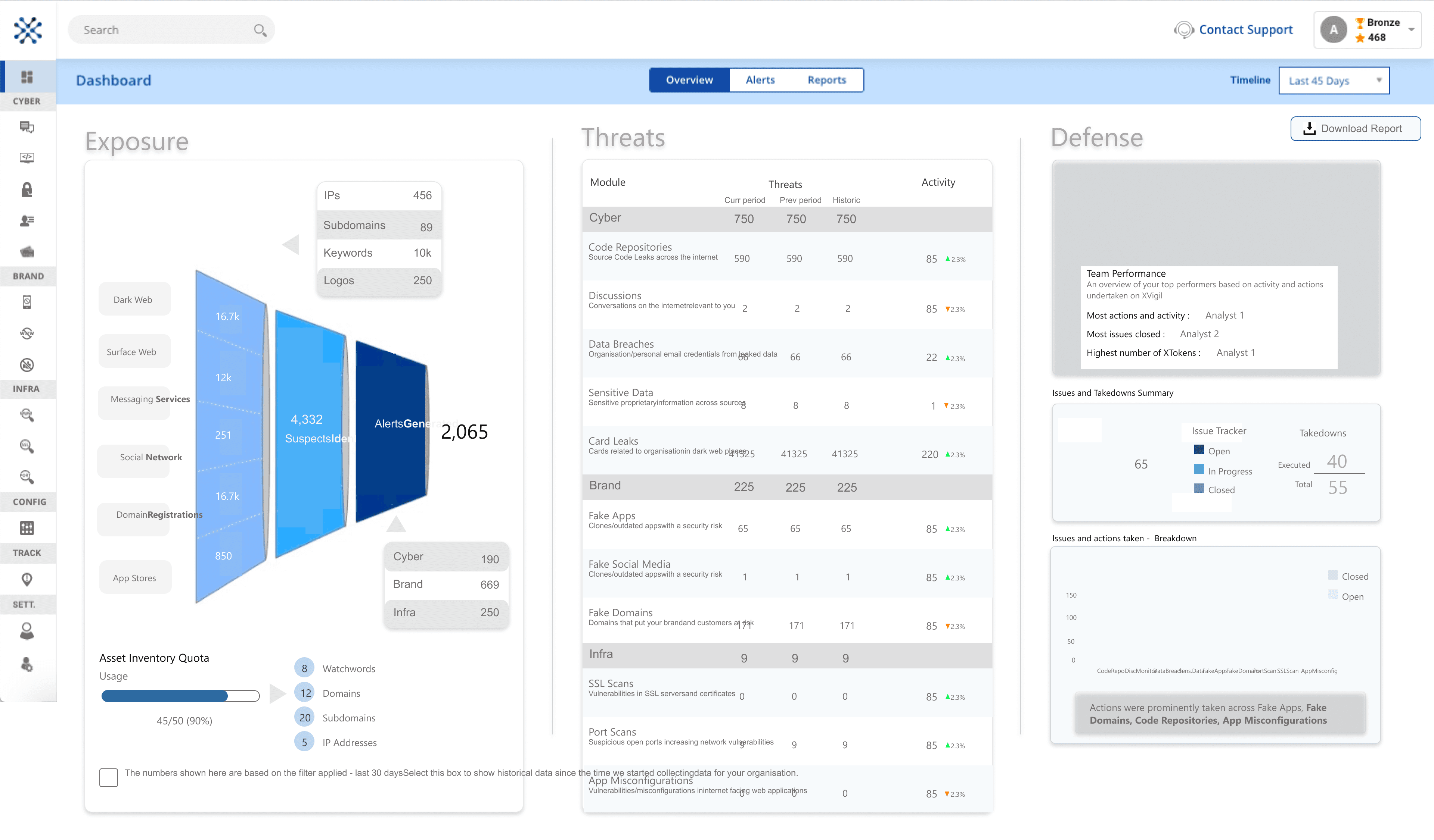
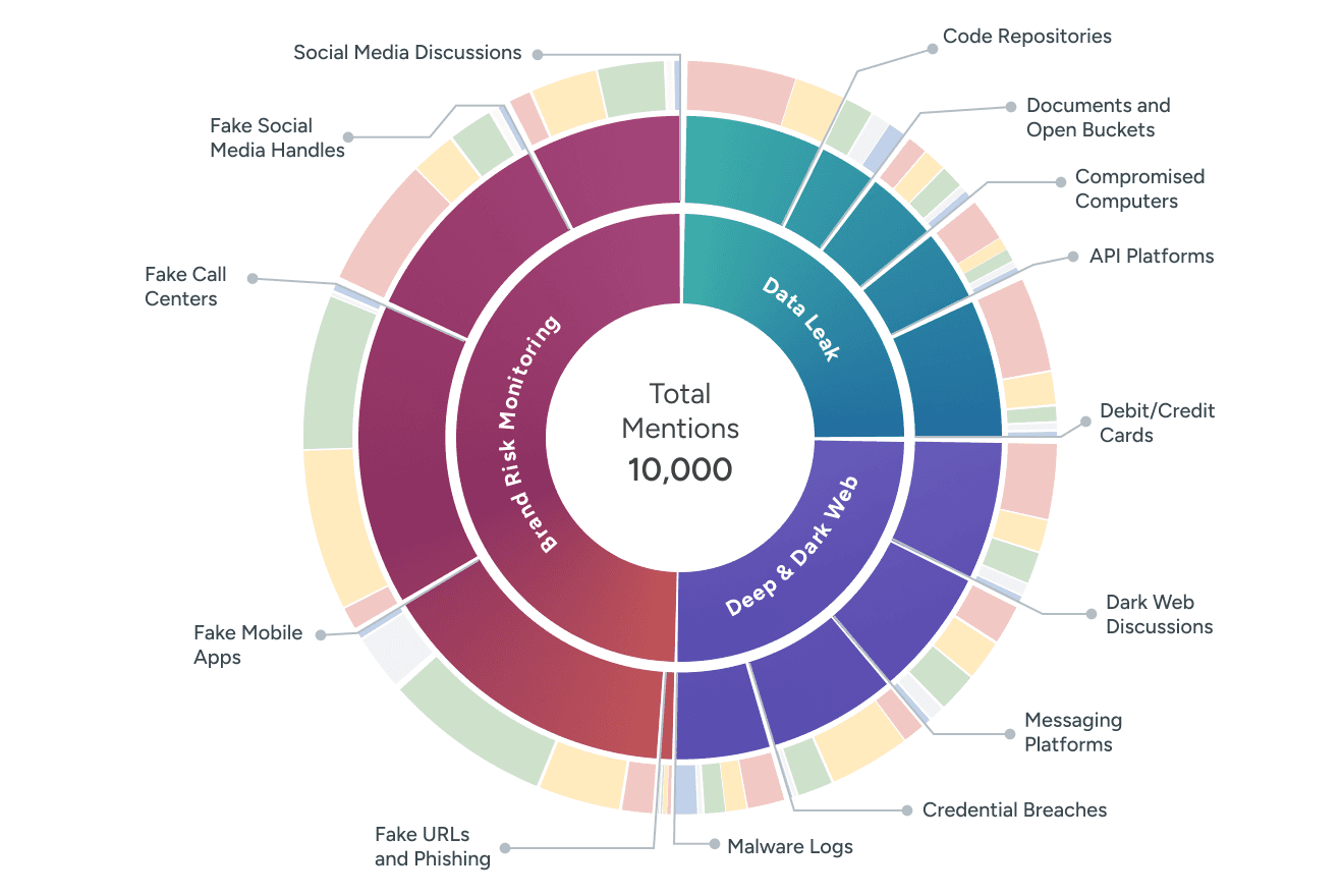
Each team's dashboard design expectations were based on their interactions with customers. It was difficult to navigate and integrate everyone's opinions, so we developed some rough concepts based on the initial insights. This was used as artifacts for stakeholders to brainstorm around and streamline all insights into a shared concept model.