storytelling my finances in data visualizations
storytelling my finances in data visualizations
Challenge
Demonstrating your knowledge and skills by designing visualizations to effectively tell a story using data.
My responsibilities
Individual project involving and end to end process from research, analysis, brainstorming and creating fincal designs of data visualizations.
Outcome
Leveraging data visualization as an appealing way to increase people's confidence in taking responsibility for their financial affairs.
Timeline
February 2022 | 1 month
Contributors
Tools
Miro, Tableau, Excel
Location
TU Delft, MSc Strategic
Product Design
Visualization report
Design Process
Collecting data
Data Representations
Development
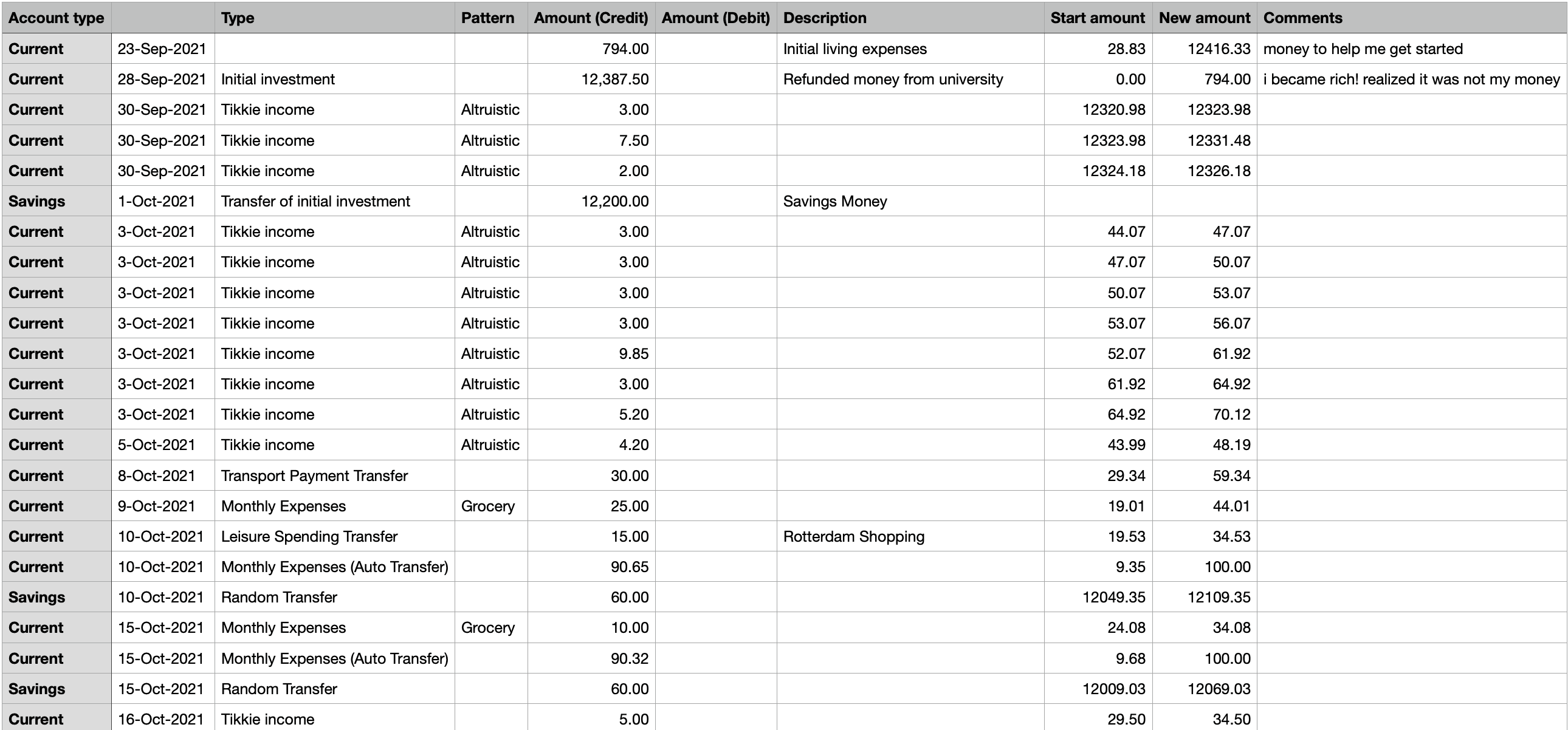
Using Excel to clean data; editing and labelling entries.
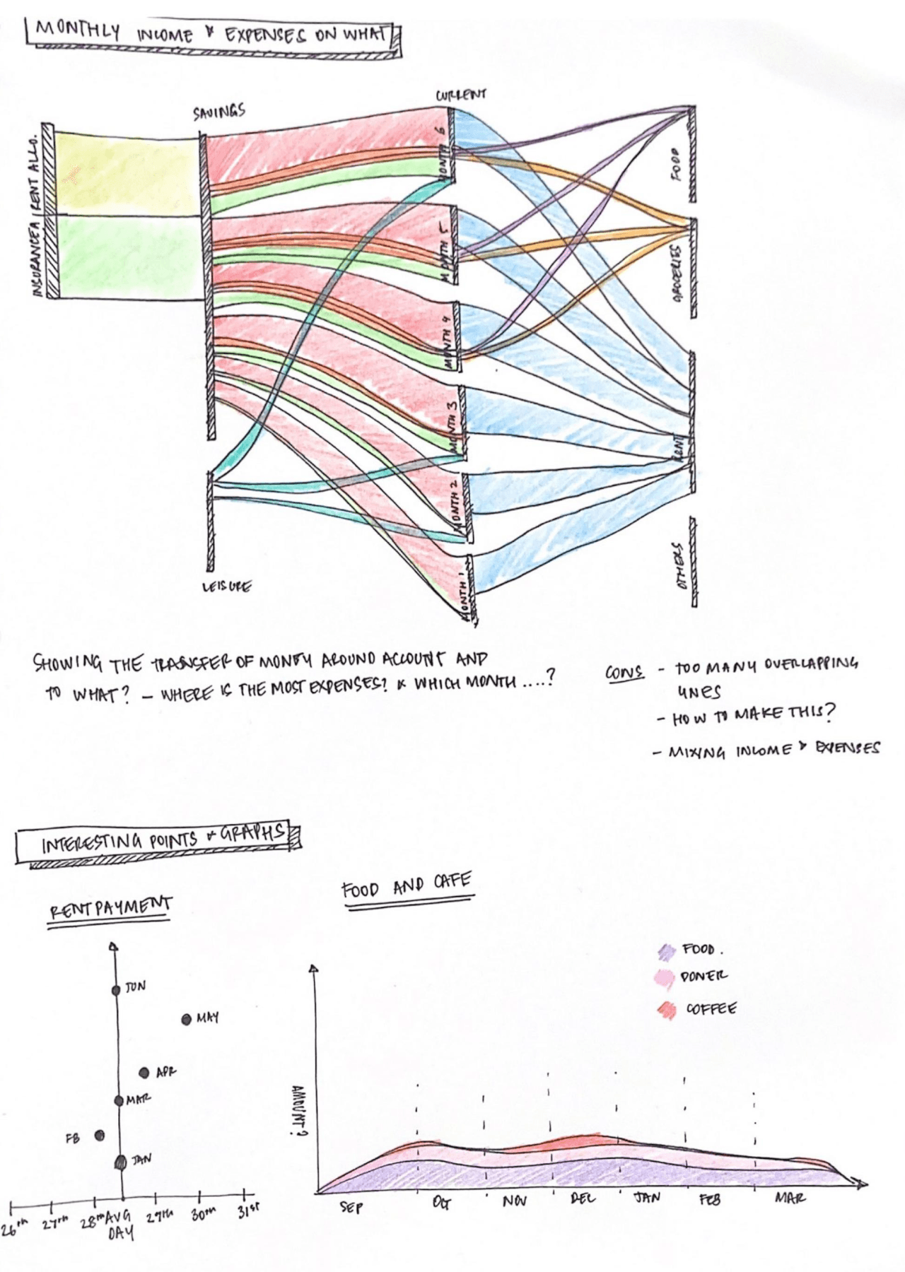
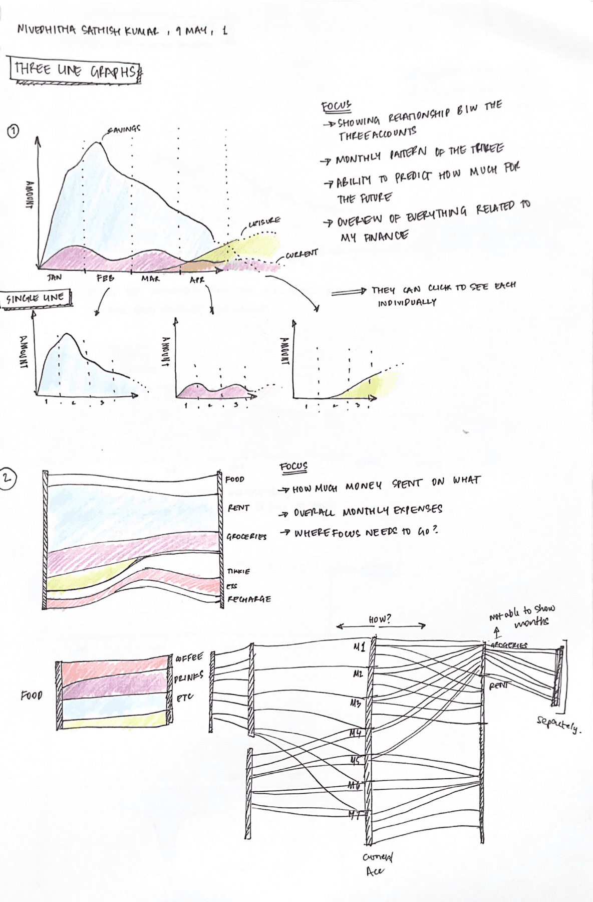
Drawing different options to represent data, ensuring the principles of data visualization.
Cleaning data and defining storyline
The initial stage in data visualization is acquiring the data and removing ambiguity from the entires. The data was consistently labeled, and unrelated columns were removed. After cleaning the data, it was evaluated to find patterns. These themes were then used to weave a story that conveyed an idea.
The goal behind my project was to leverage data visualizations to make finance more appealing, removing the daunting nature that makes individuals afraid of handling their financial affairs.

Cleaning data and labelling patterns
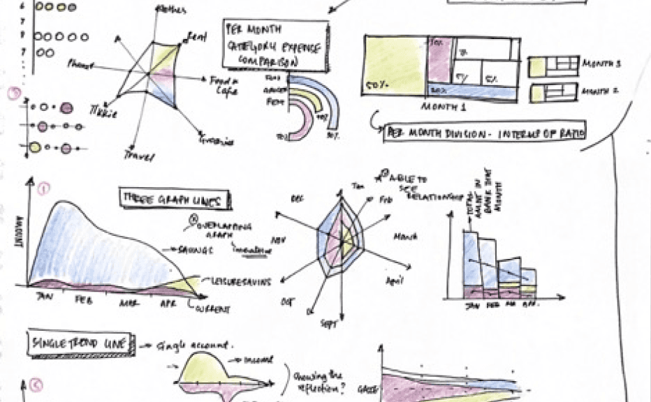
Sketching options
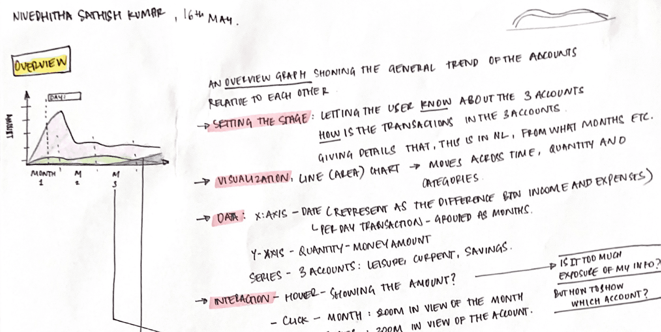
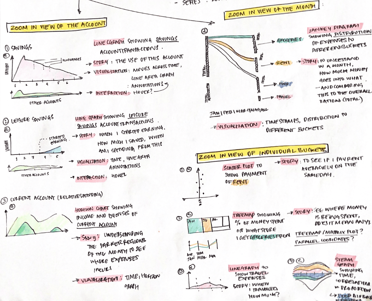
Using theoretical understanding of data visualization, ideas were sketched out to better portray the data. An important issue is to map the data accurately to the principles of the representations and comprehend the type of representation (categorical, sequential, etc).

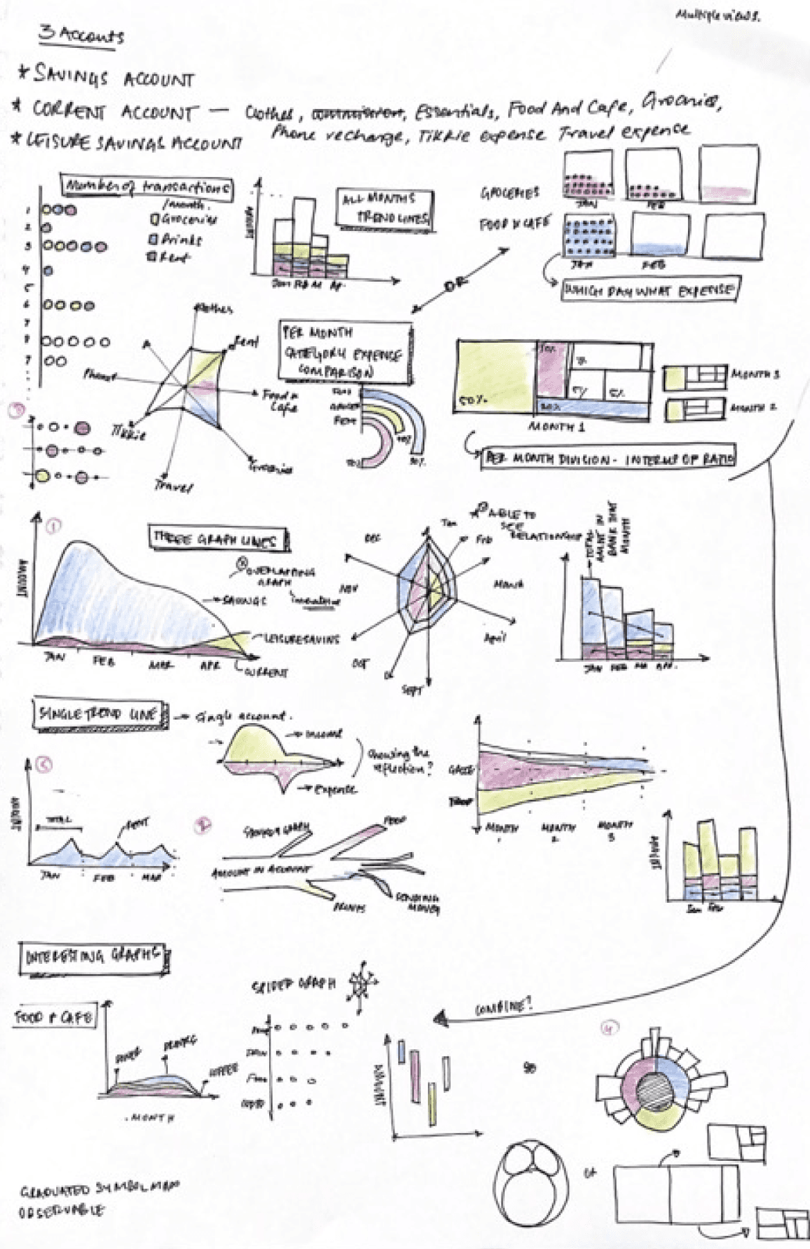
Multiple representations for the same
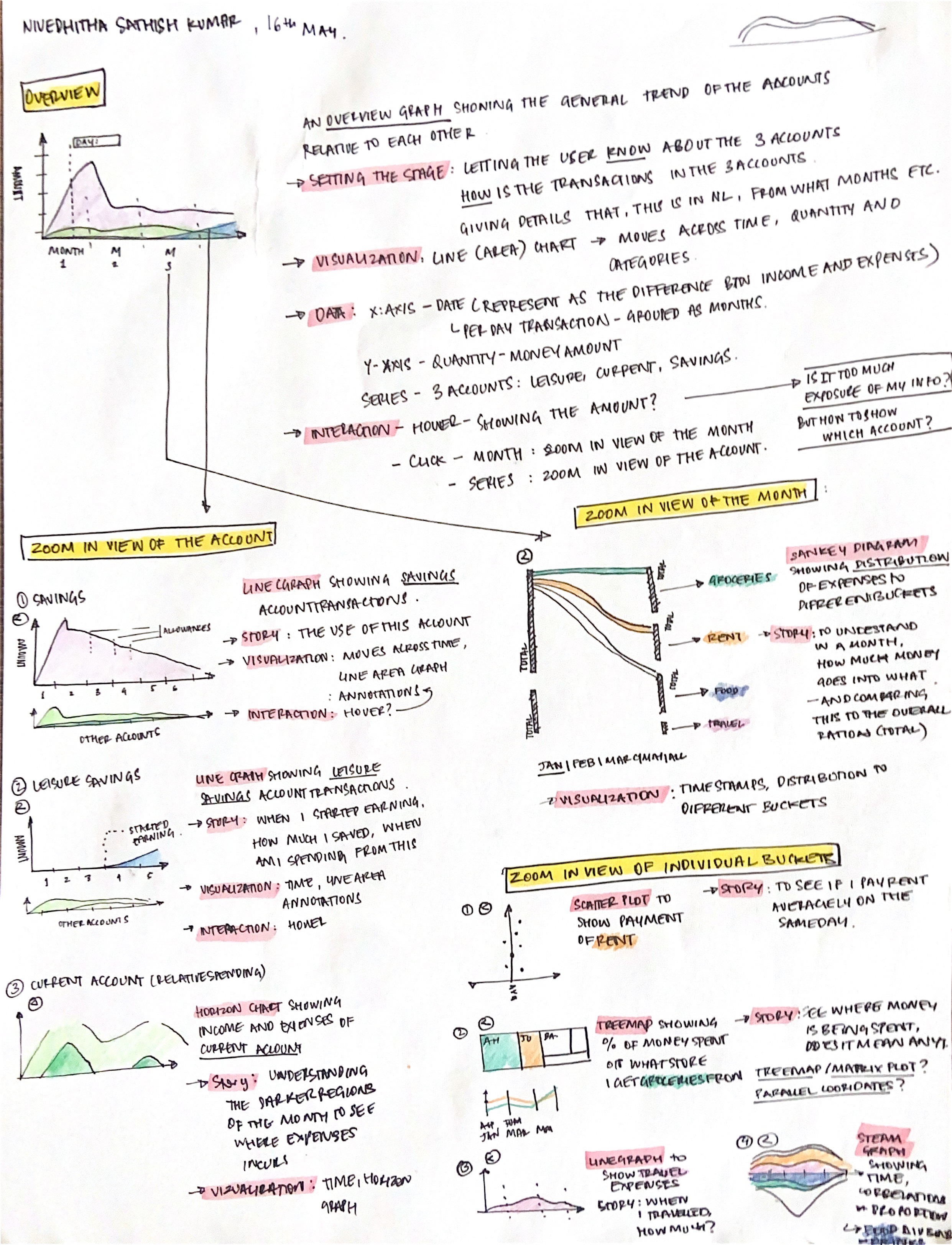
Detailing
The visualizations were chosen based on how close it represents the data and if it is easy to understand. The chosen ones were detailed to add aspects of interactability, structure, layout, and flow.

Cleaning data and labelling patterns
Final Design
The visuals were created using Tableau Software, a data visualization software. Because it was my first time using the platform, I went through tutorials and trial and error before settling on the final design.
You can access the report here
The report flow
Overview > Day by Day Expenses > Month by Month expenses > Specific graphs > Forecast

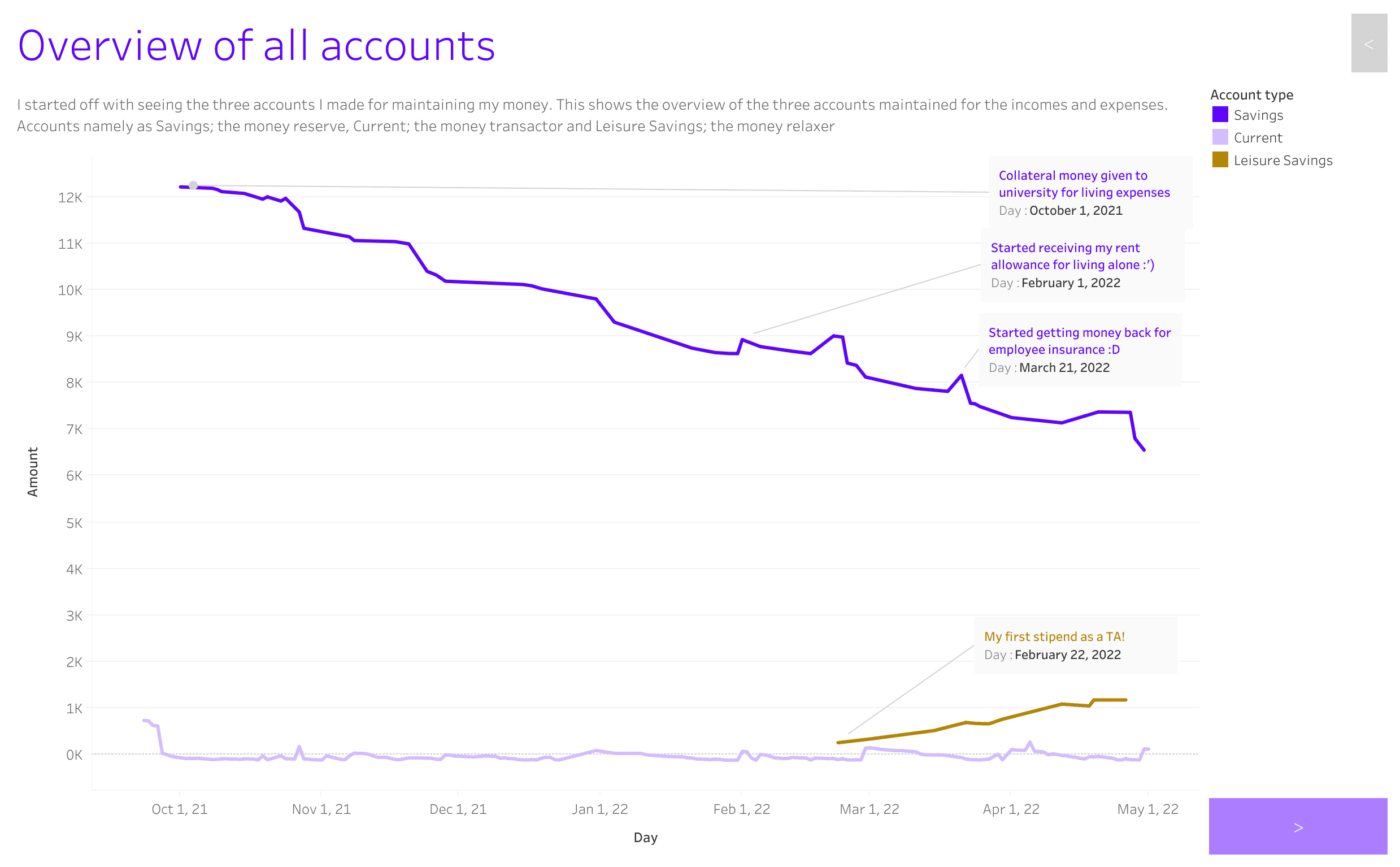
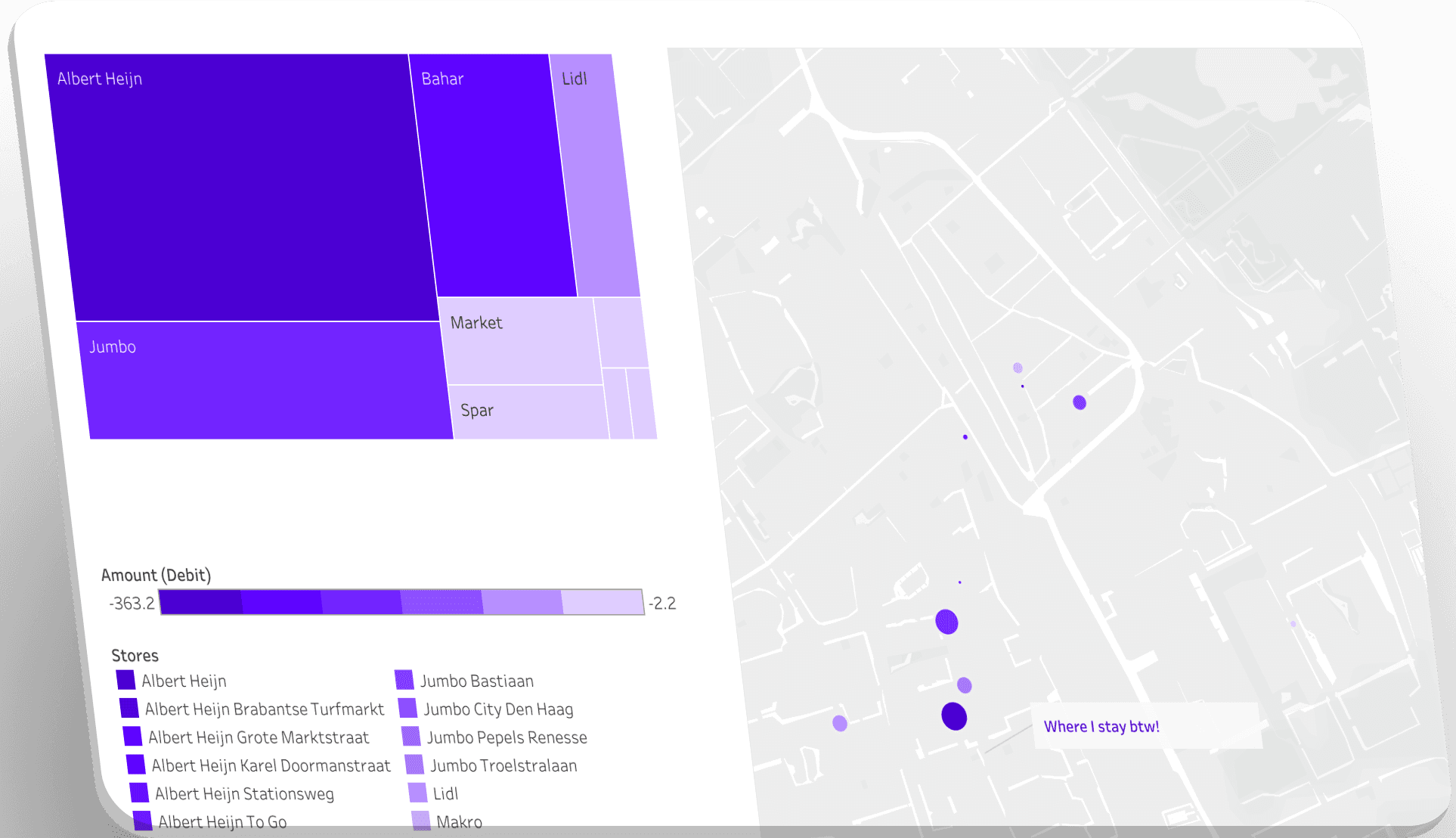
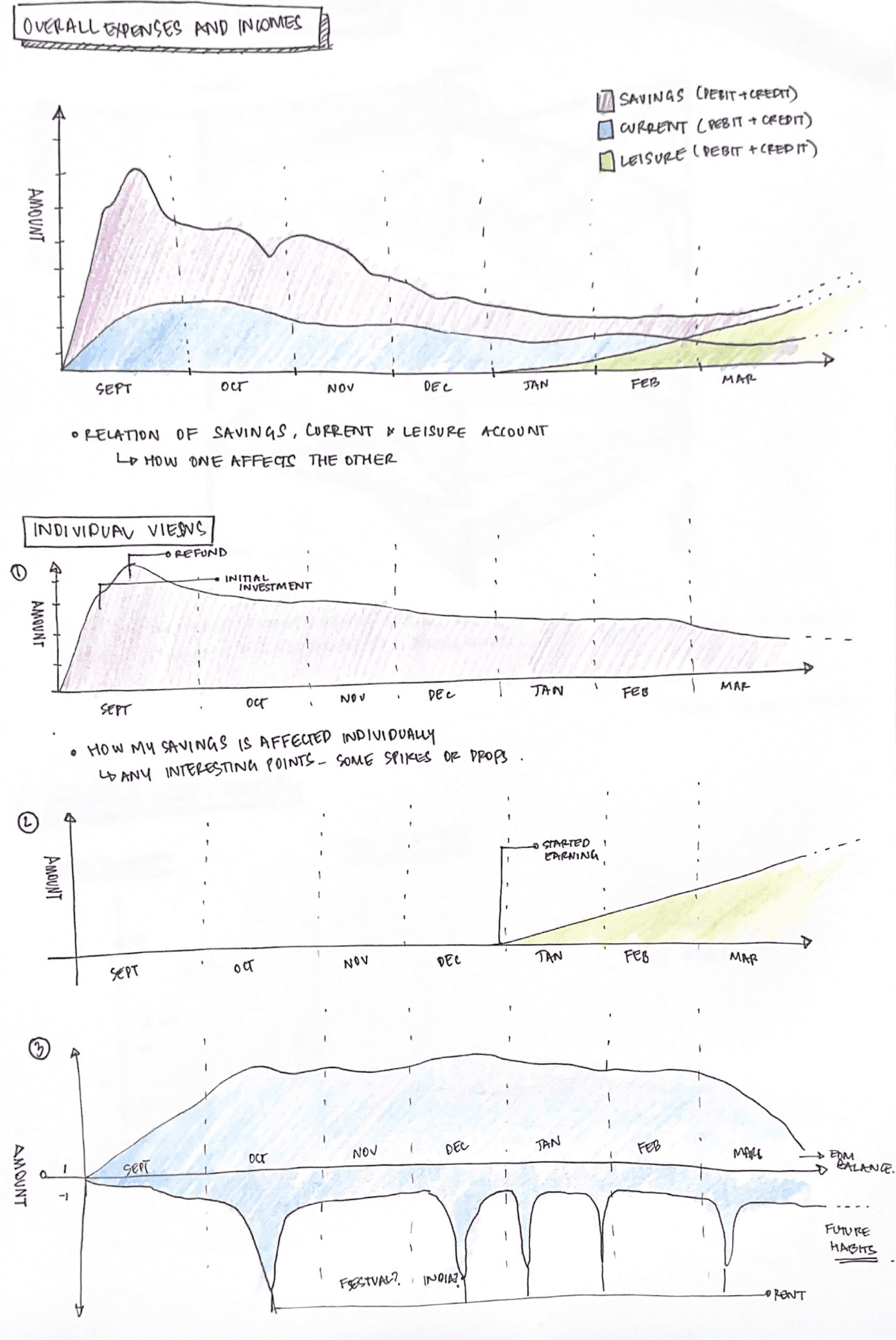
An overview of all my accounts showing the increasing/ decreasing trend.
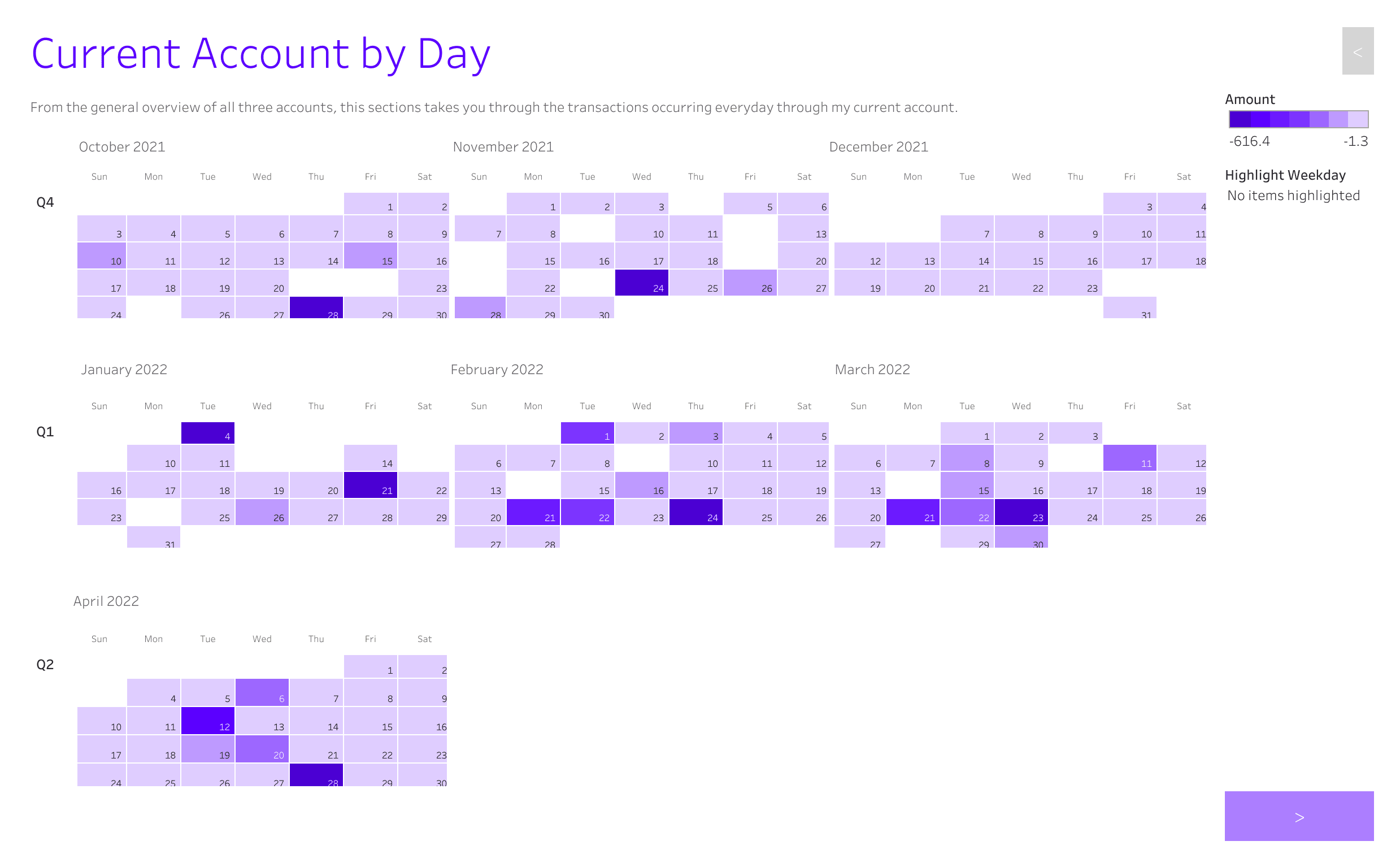
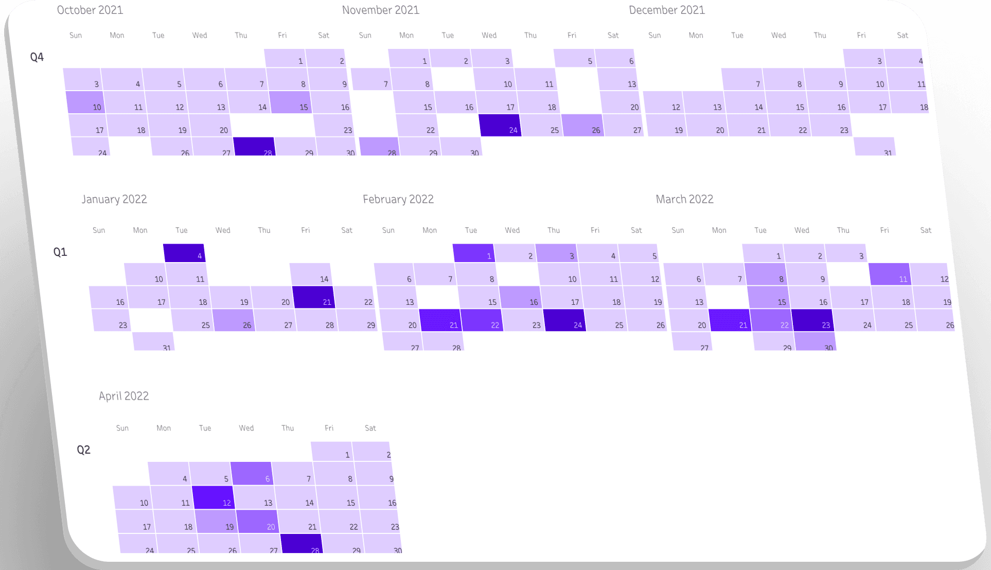
Calendar representation showing day-to-day expenses
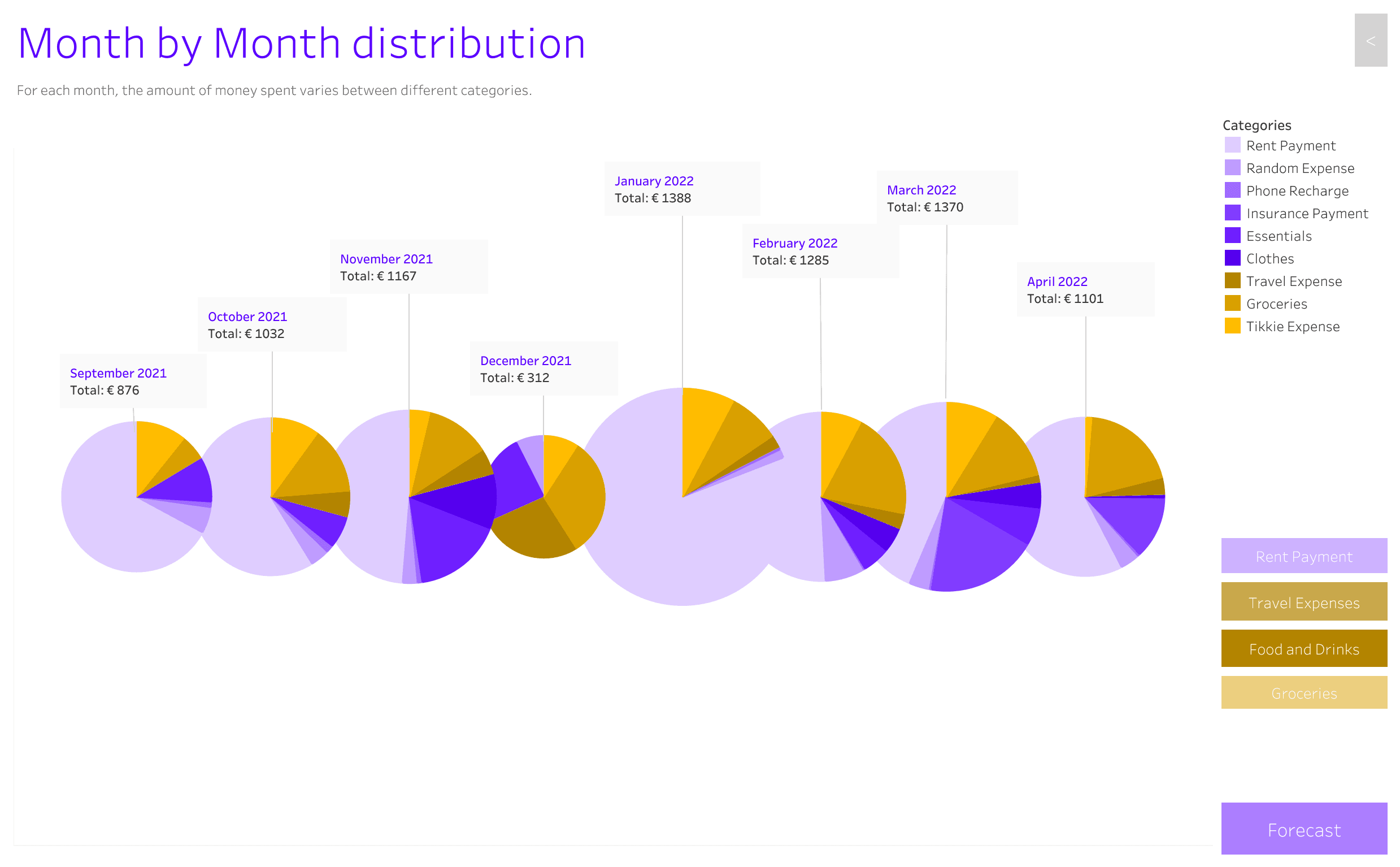
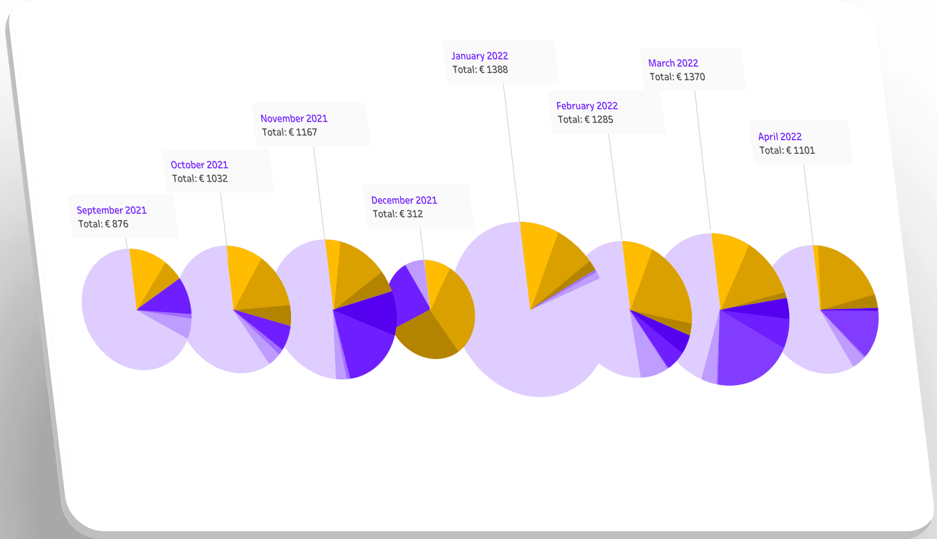
Abstracted pie chart representation showing categorical data within the pie chart and trend over time as a whole.

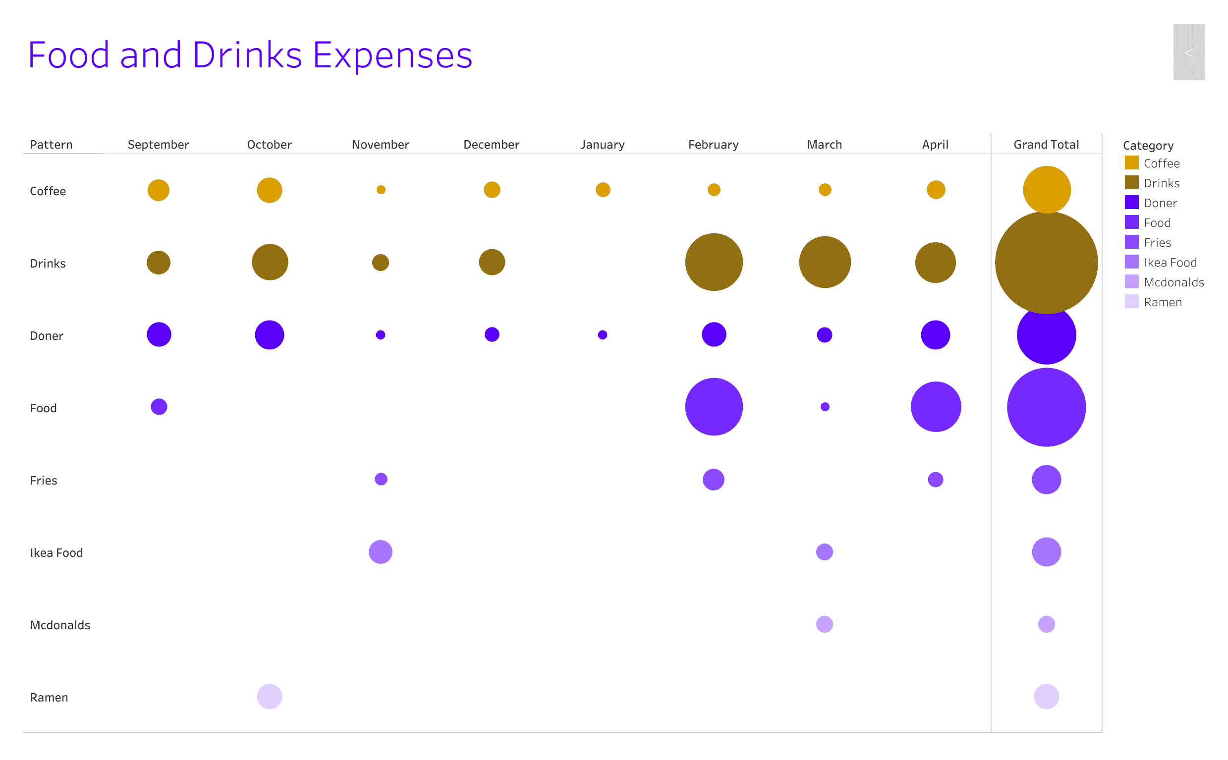
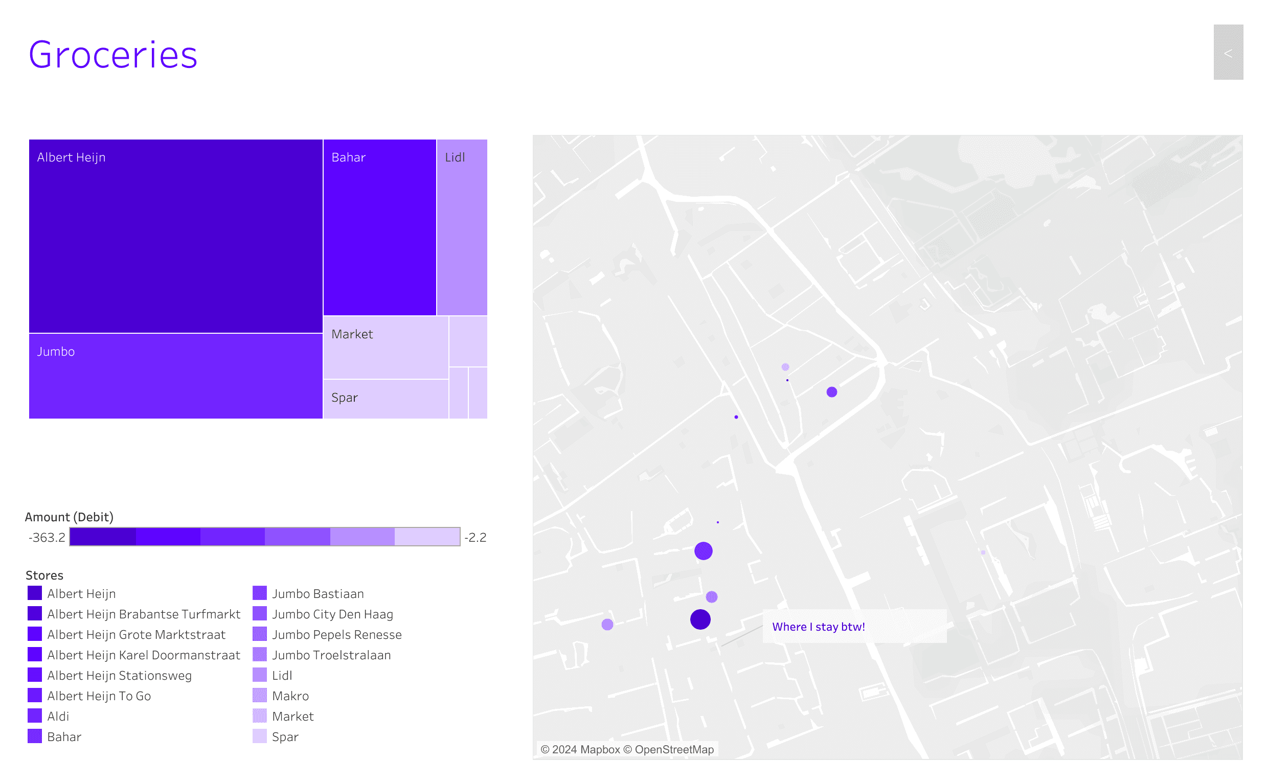
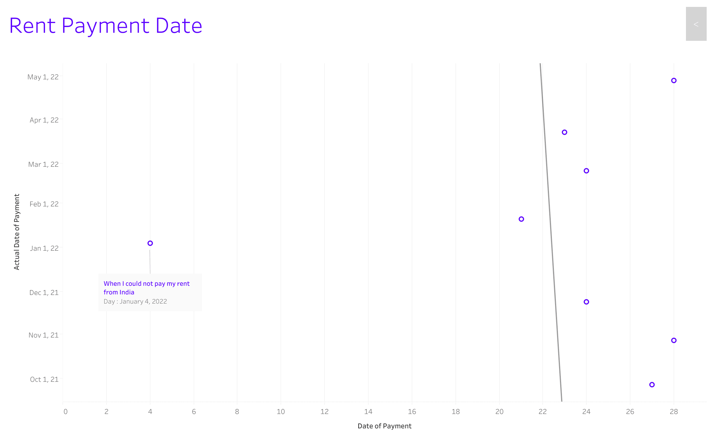
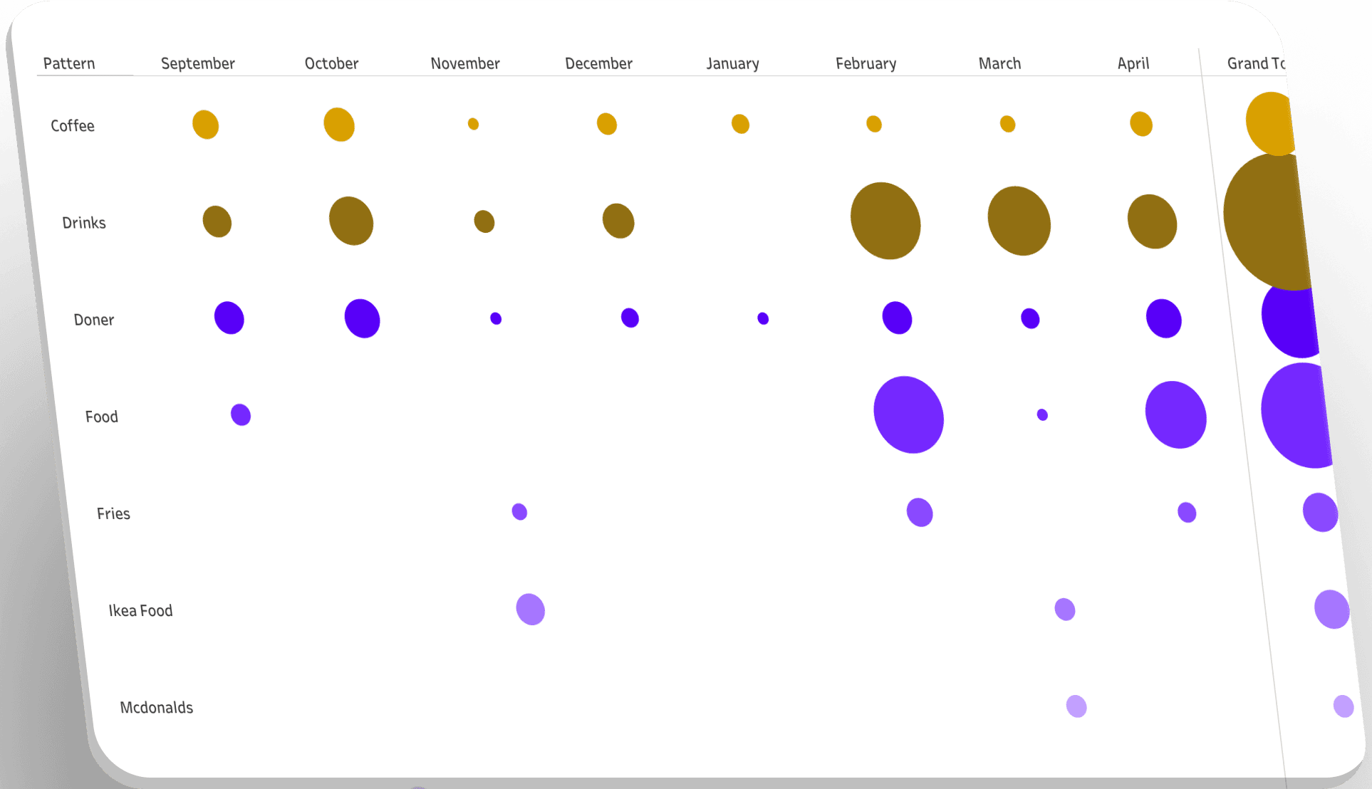
Smaller graphs showing expenses on different categories like rent, food, groceries etc.
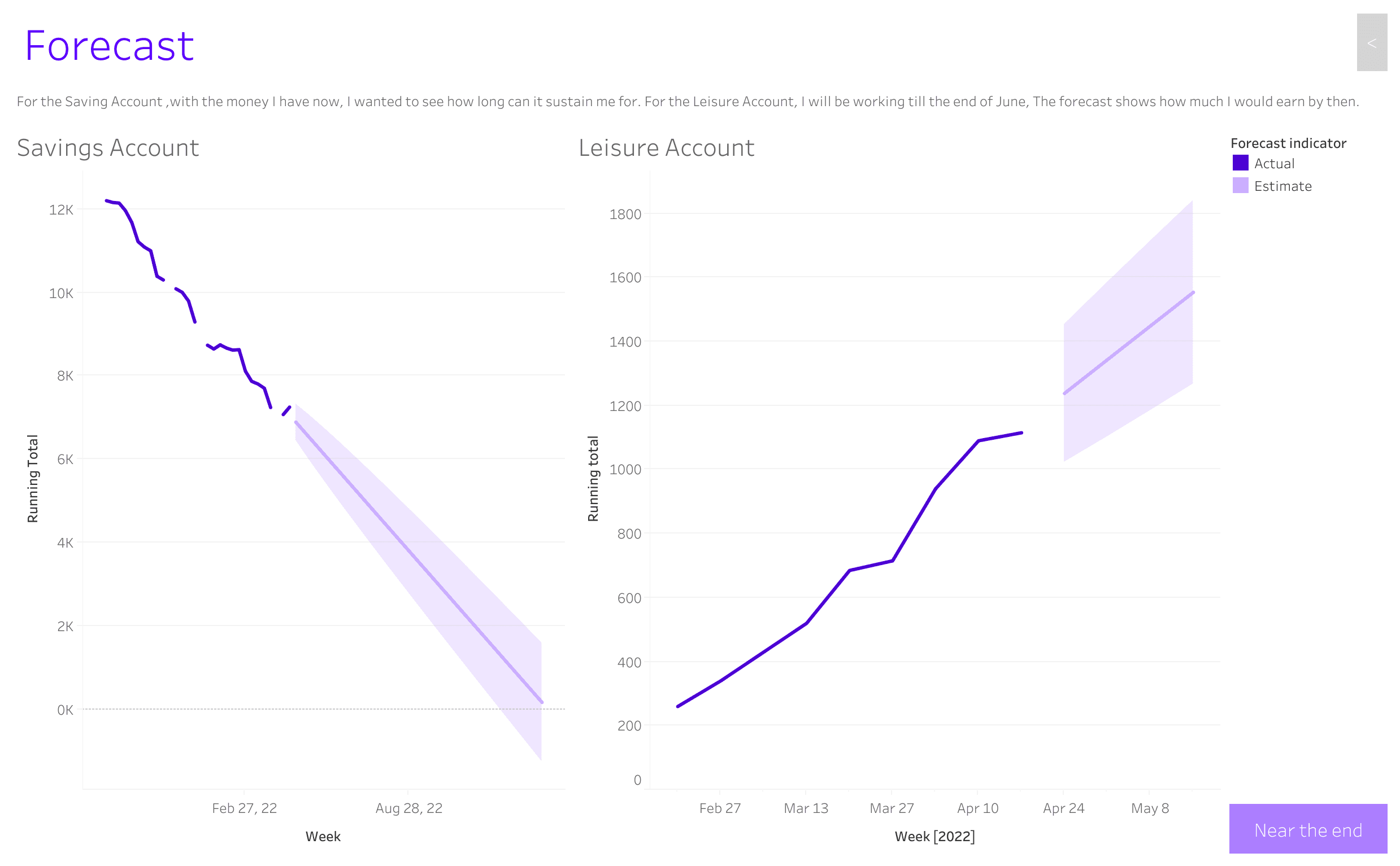
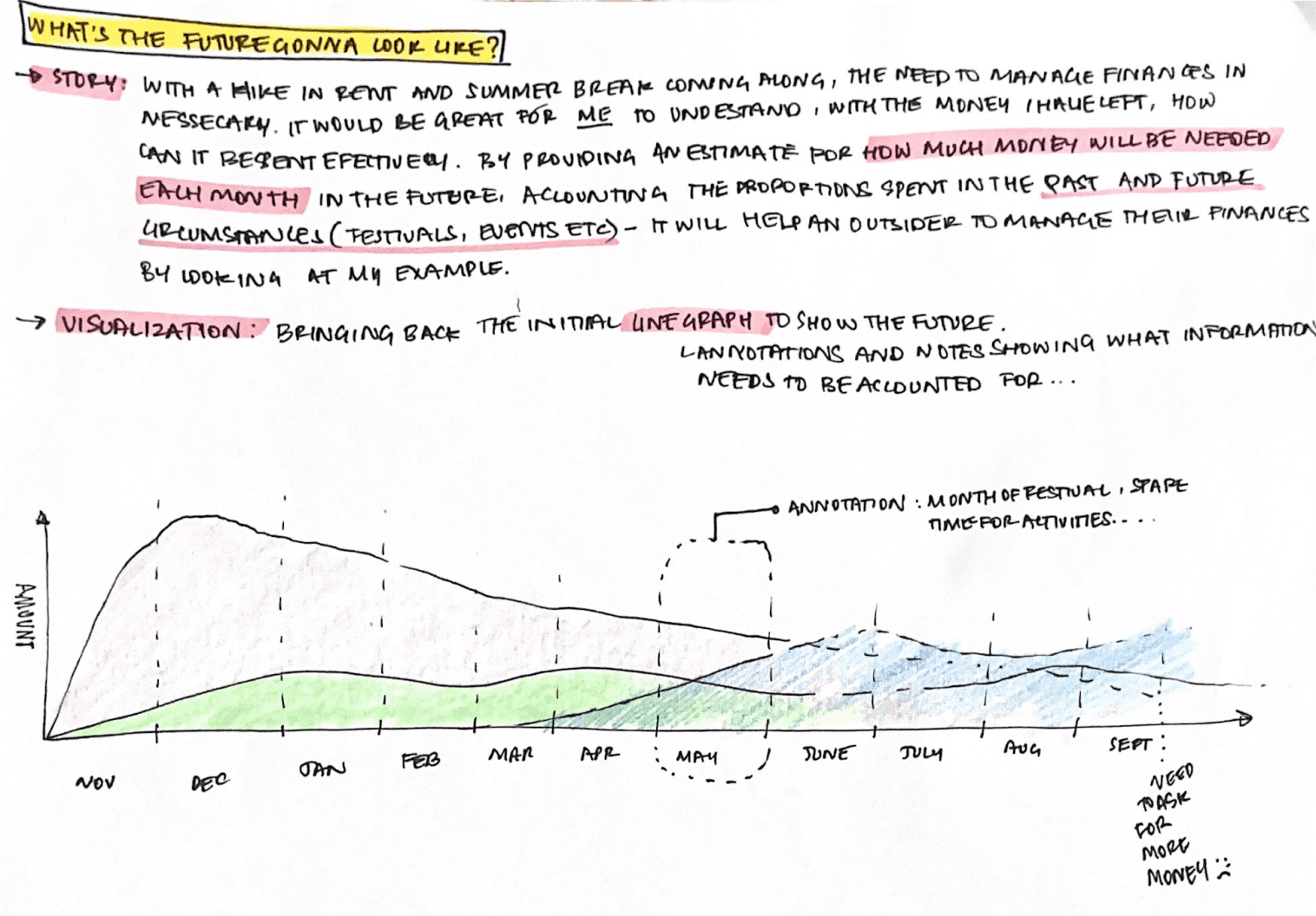
Forecasting the progression of income and savings.
💡 Key Learnings
Tableau Software, as a data visualization tool, was absolutely new to me. I enjoyed working on the platform since it provided me a lot of leeway to experiment. I learned the software through tutorials and frequent interactions with lecturers and fellow students.
While working on the software, I encountered numerous challenges because the data cleansing I performed did not correspond to the operations of the software. This made me go back and forth a lot. The next time, I will comprehend the tool I use so that the previous work is completed correctly.
The theoretical aspect was crucial as it involved understanding a lot of fundamentals, presentation themes, and new trends. This foundation was useful in later work with data visualization.
Best viewed on desktop
Review my case study on the desktop. It will soon be responsive to view on mobile :)

Best viewed on desktop
Review my case study on the desktop. It will soon be responsive to view on mobile :)